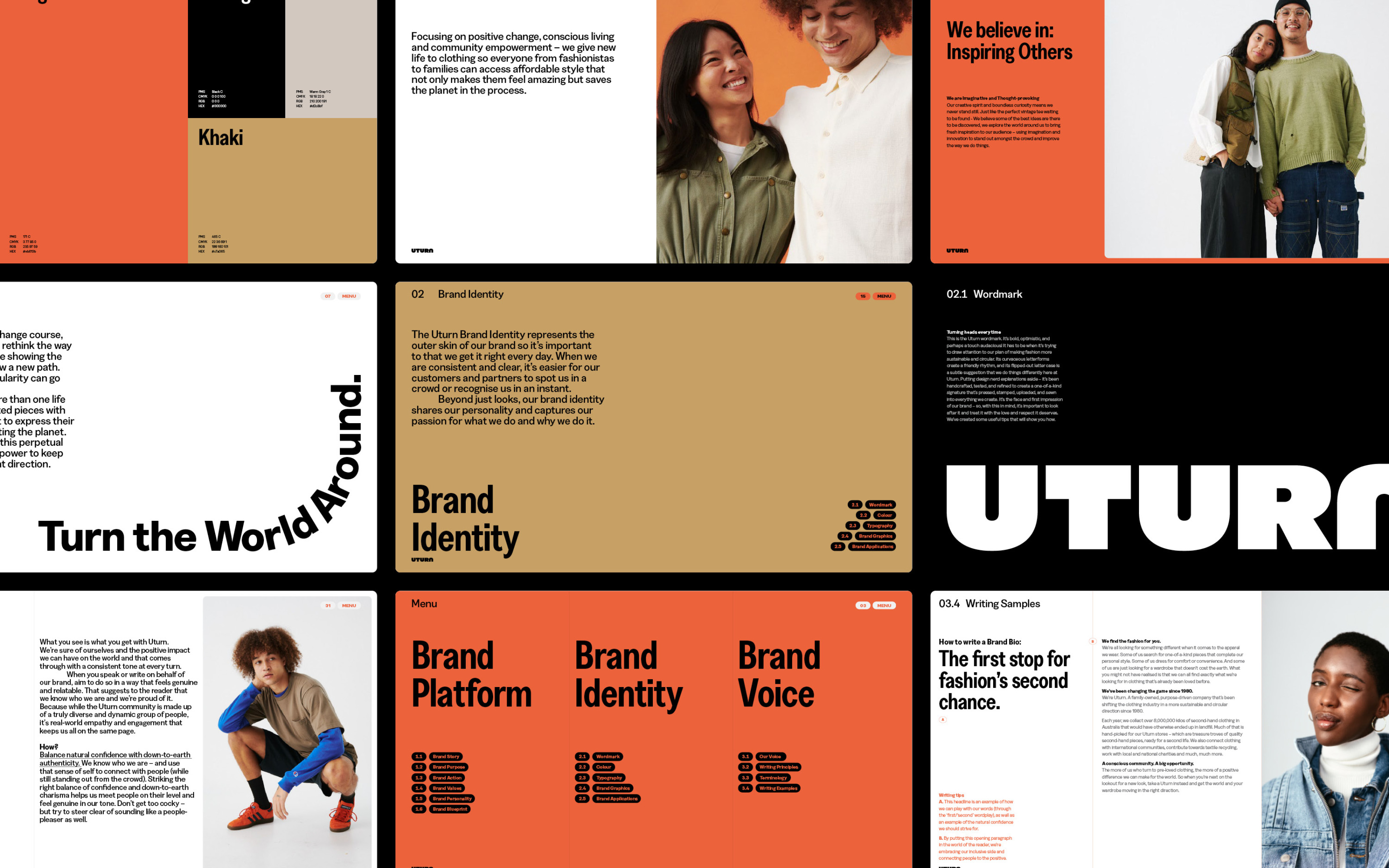
Uturn
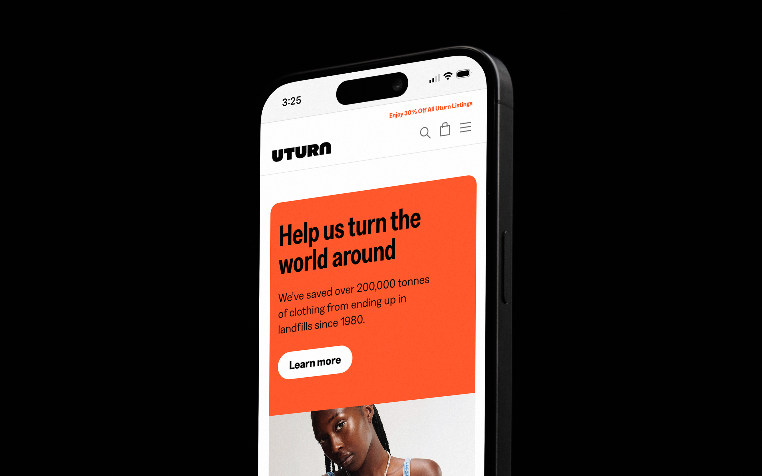
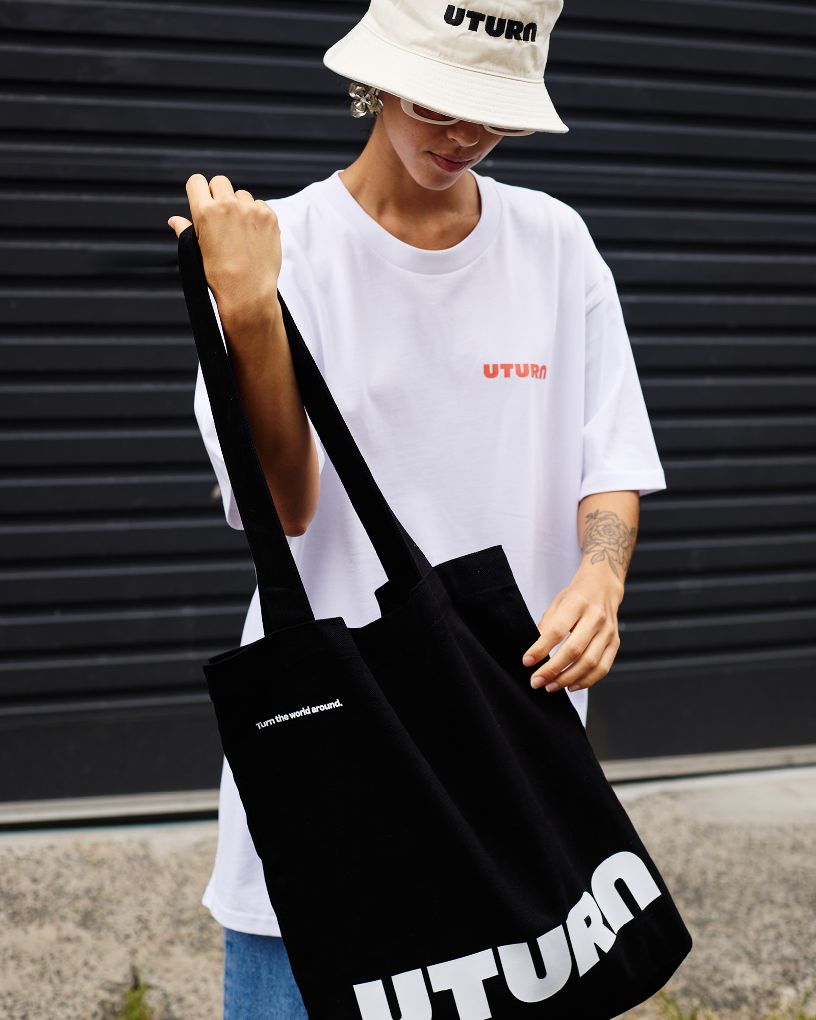
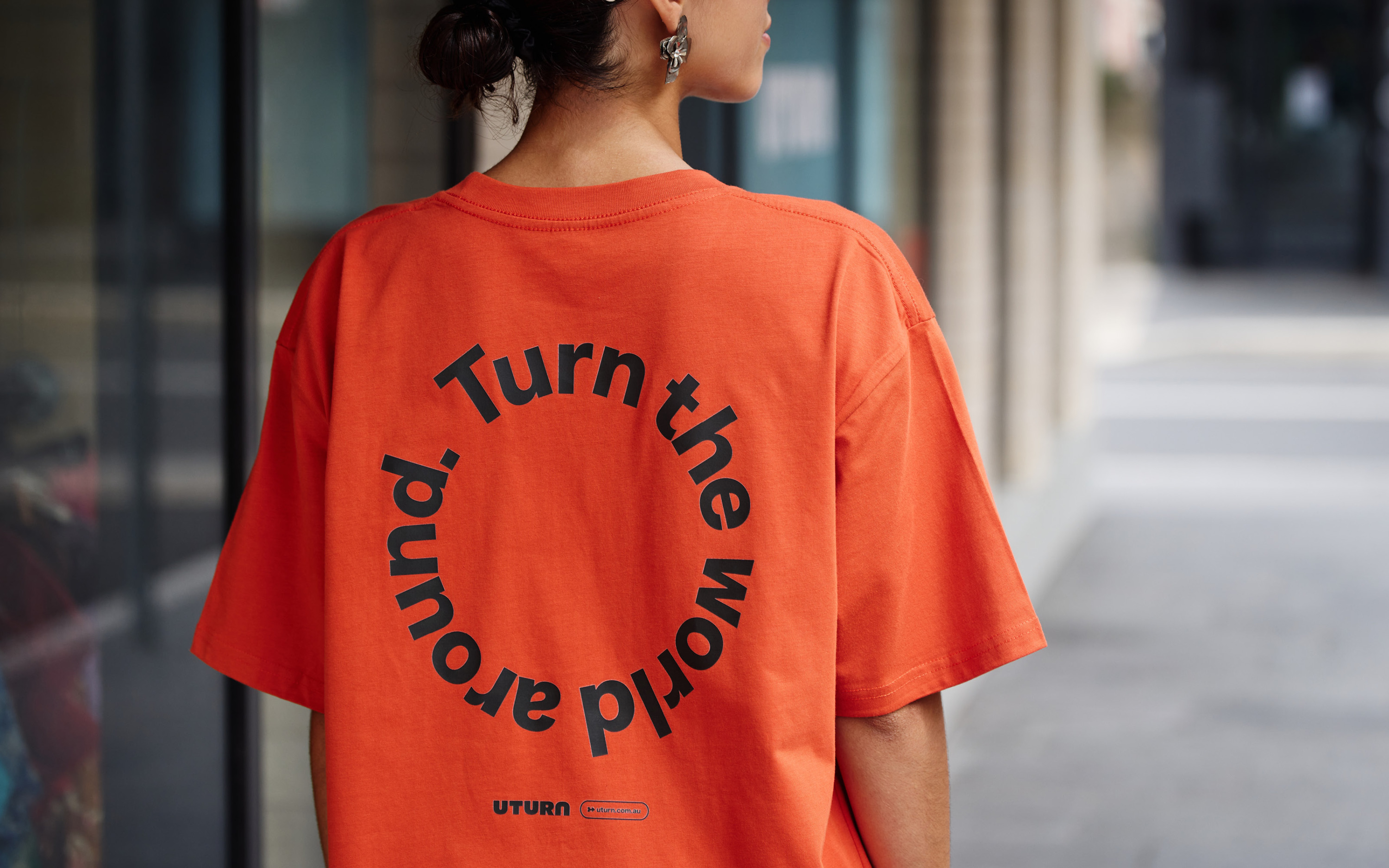
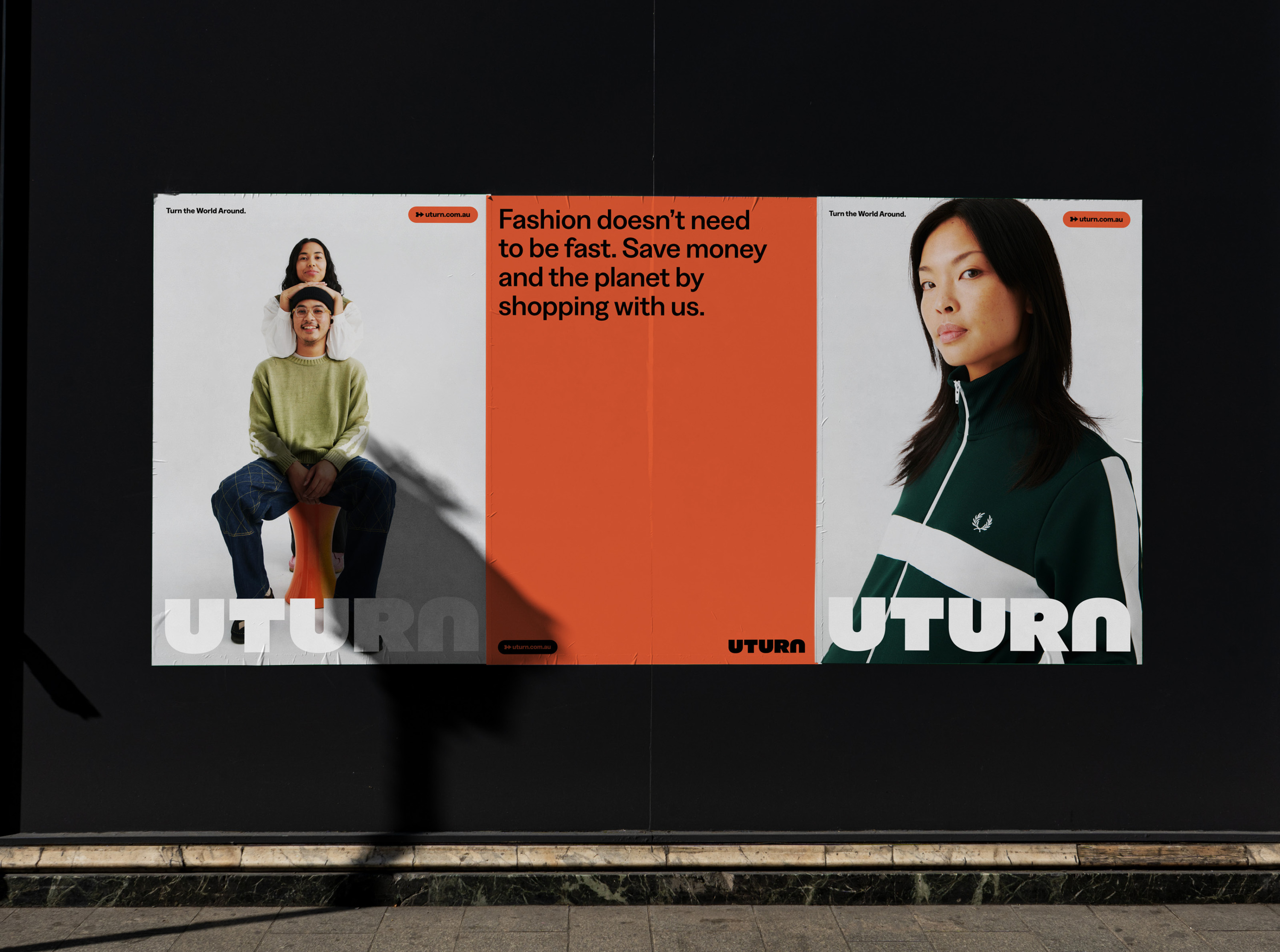
In a world dominated by fast fashion, Uturn is redefining what pre-loved apparel means — not just for fashion enthusiasts but for communities and everyday shoppers alike. More than a brand, Uturn is a movement – an inclusive space that challenges the perceived dollar value of style while addressing the global crisis of fashion waste. At its core is a simple yet powerful belief: fashion doesn’t have to keep moving in the same direction — a vision captured in their purpose, Turn the World Around.
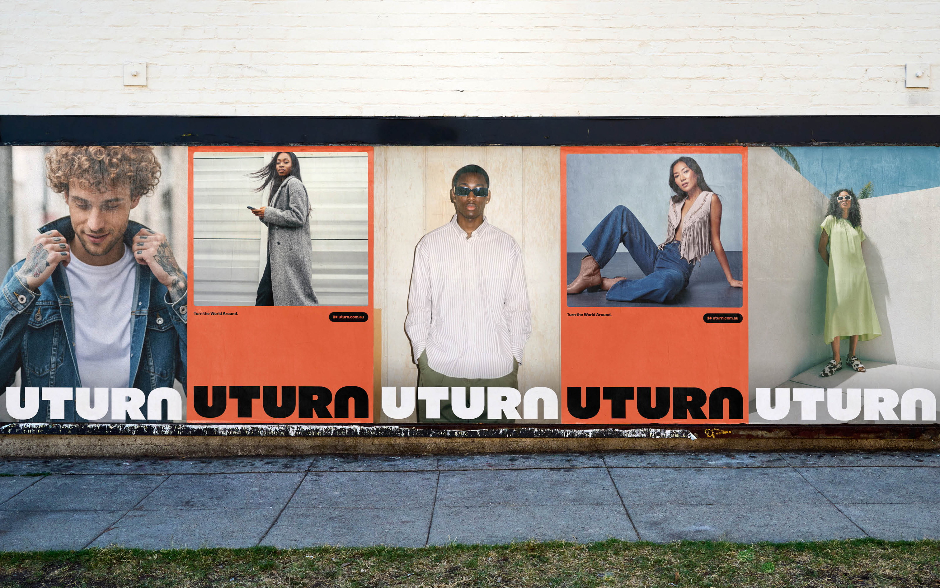
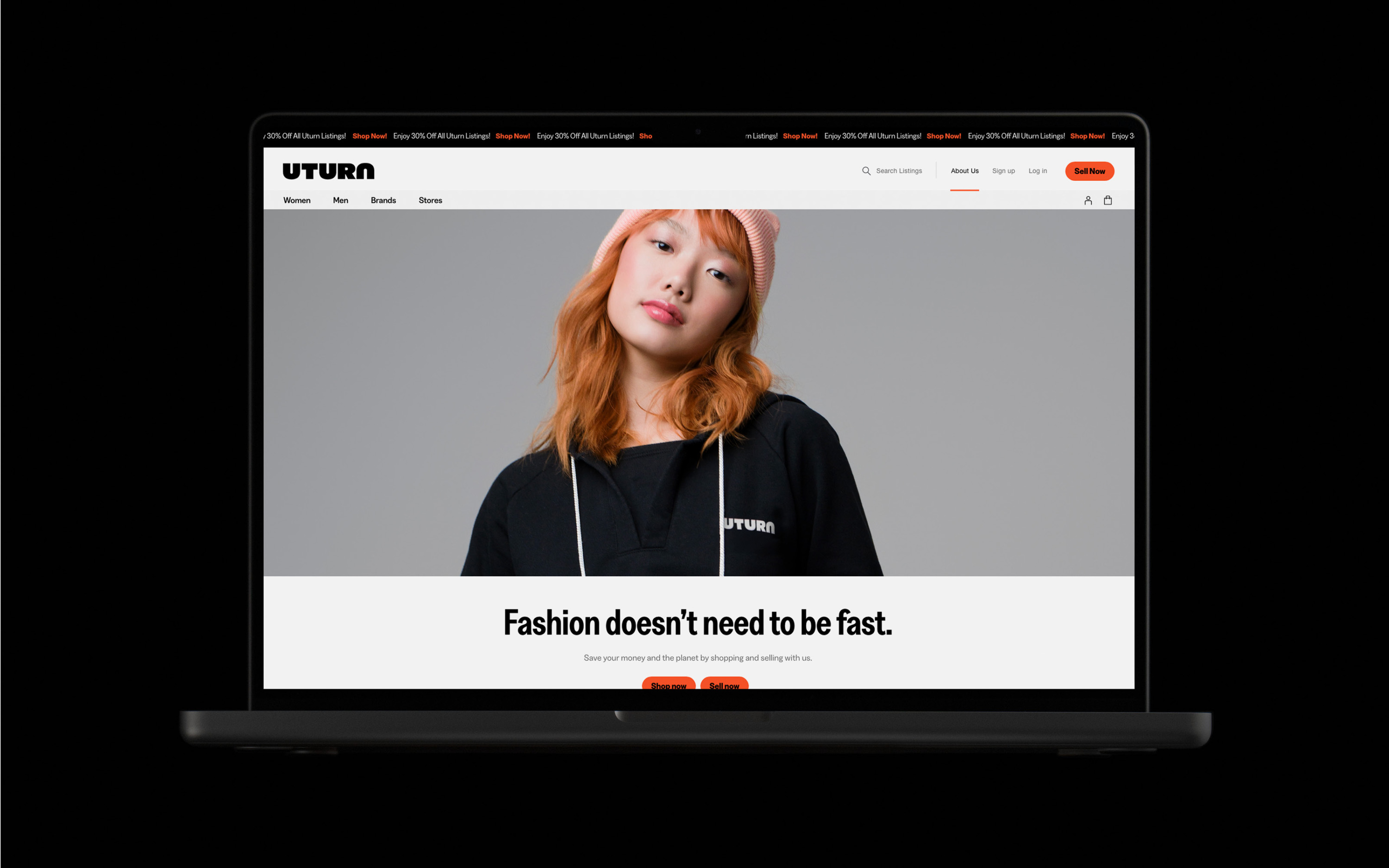
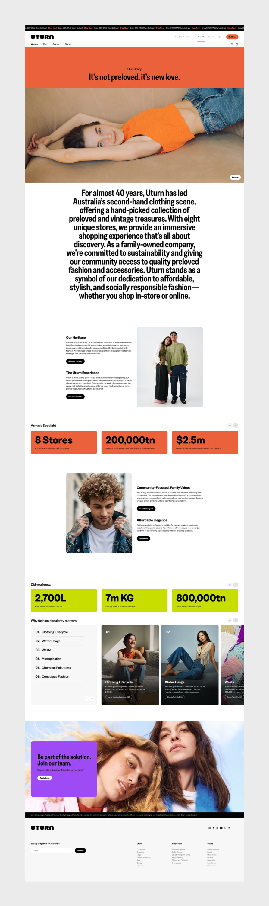
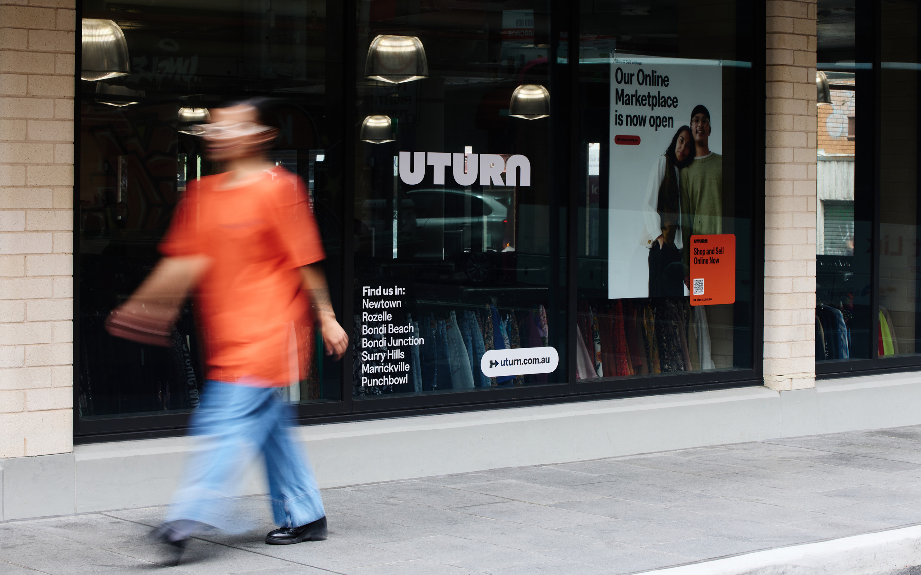
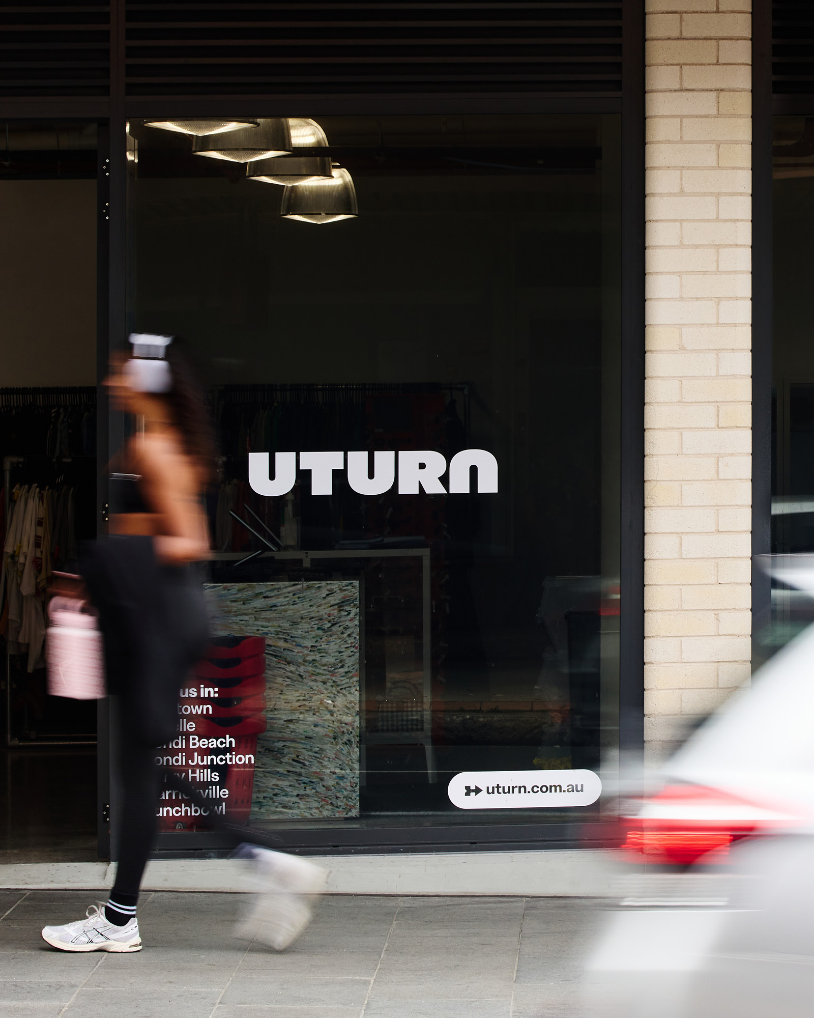
As Uturn expanded its network of stores, we were brought in to help scale their brand while staying true to their ethos. Our role was to create a cohesive brand strategy and identity that integrates seamlessly across their growing retail presence — standing out in urban neighbourhoods while feeling at home within them.
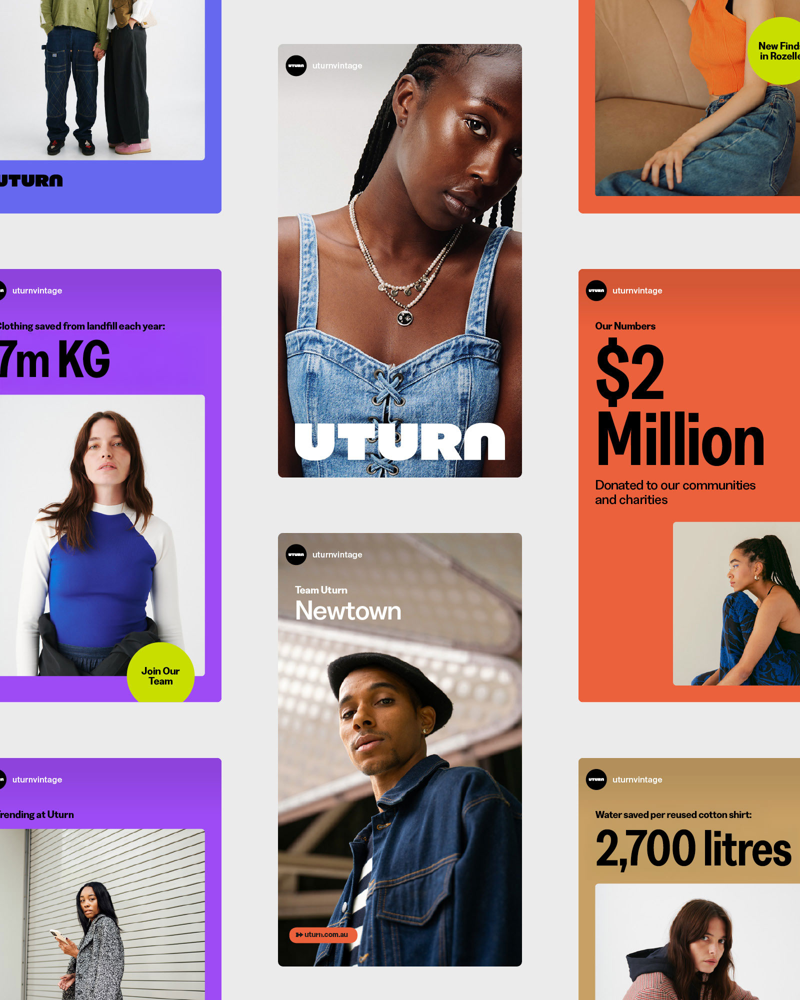
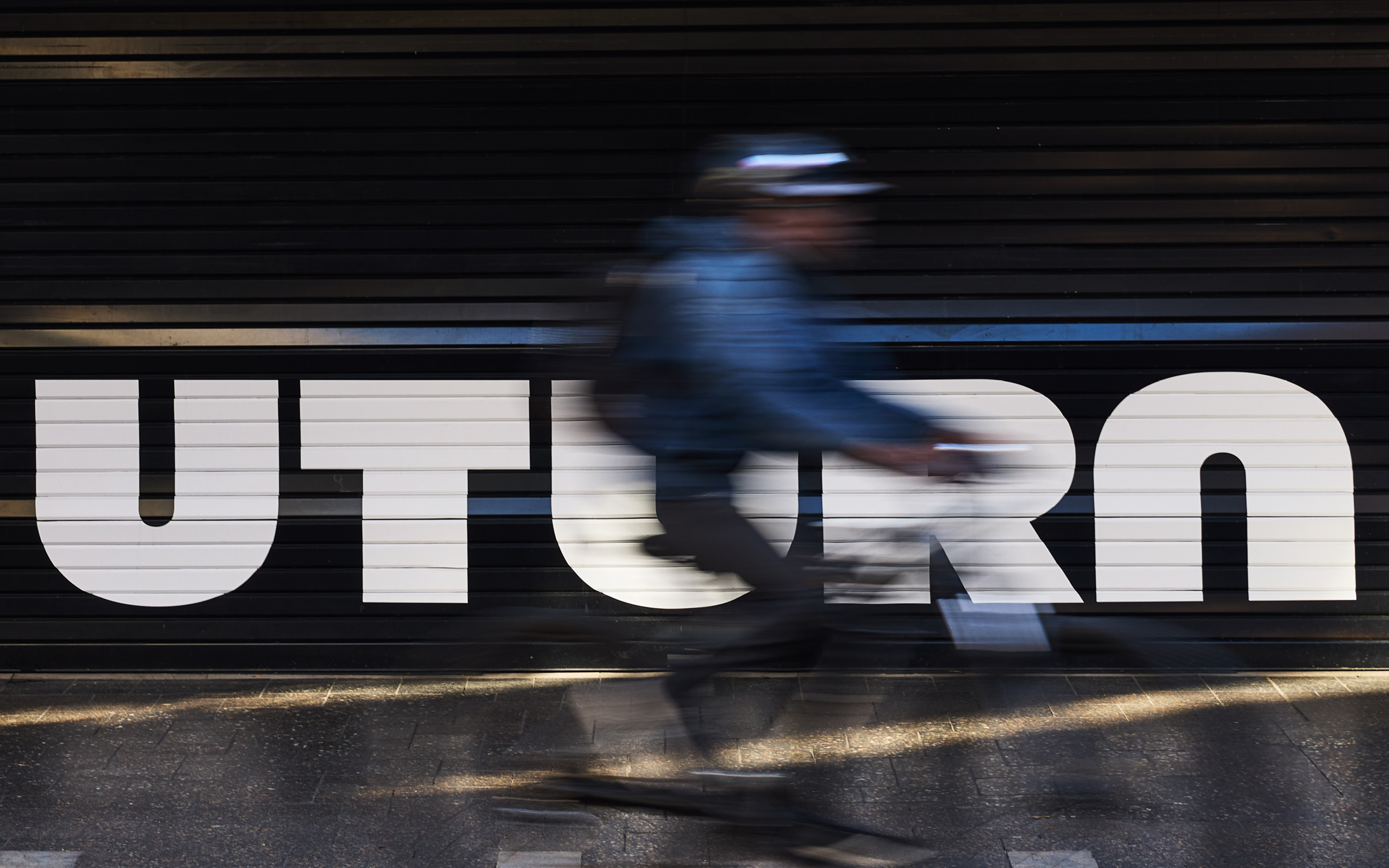
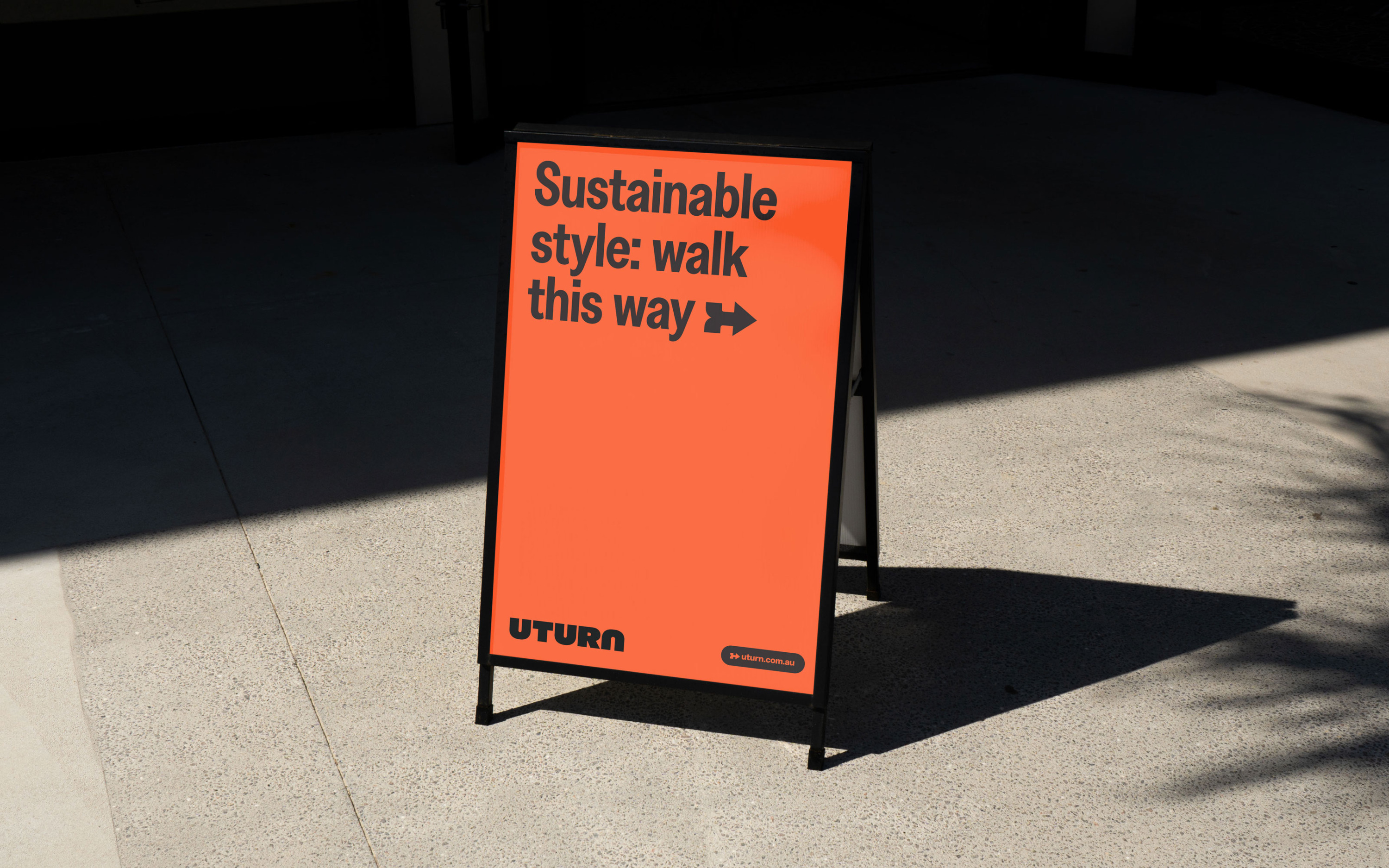
The new identity builds on the movement at the heart of their name. Purposefully bold and unapologetic, the Uturn brandmark embodies the perpetual motion of circular fashion with its audacious character strokes. This energy extends throughout the brand, with an animated design language infused with playful shifts, dynamic gestures, and a sense of positive momentum.
With a brand identity as impactful as its purpose, Uturn is poised to continue shifting perceptions—redefining the future of circular fashion, one wardrobe at a time.