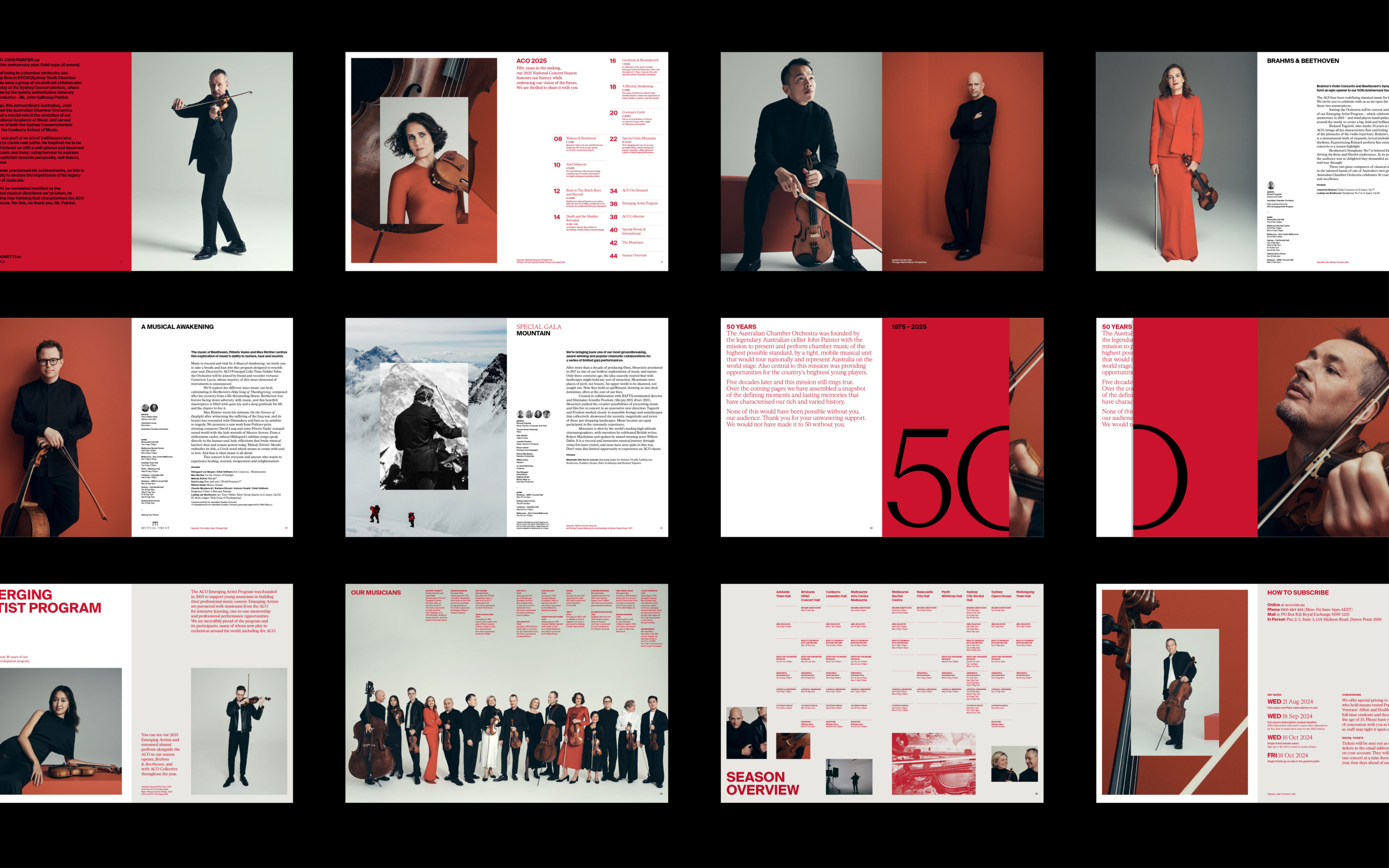
Australian Chamber Orchestra 2025
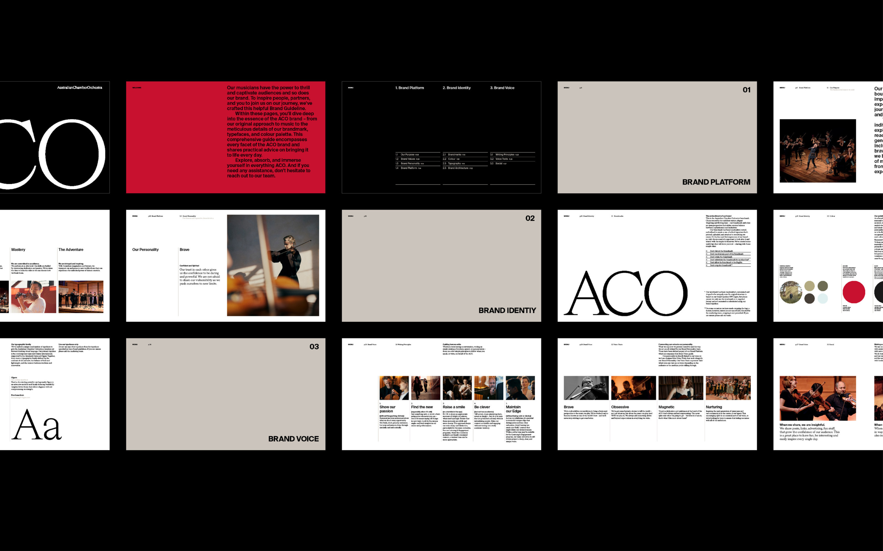
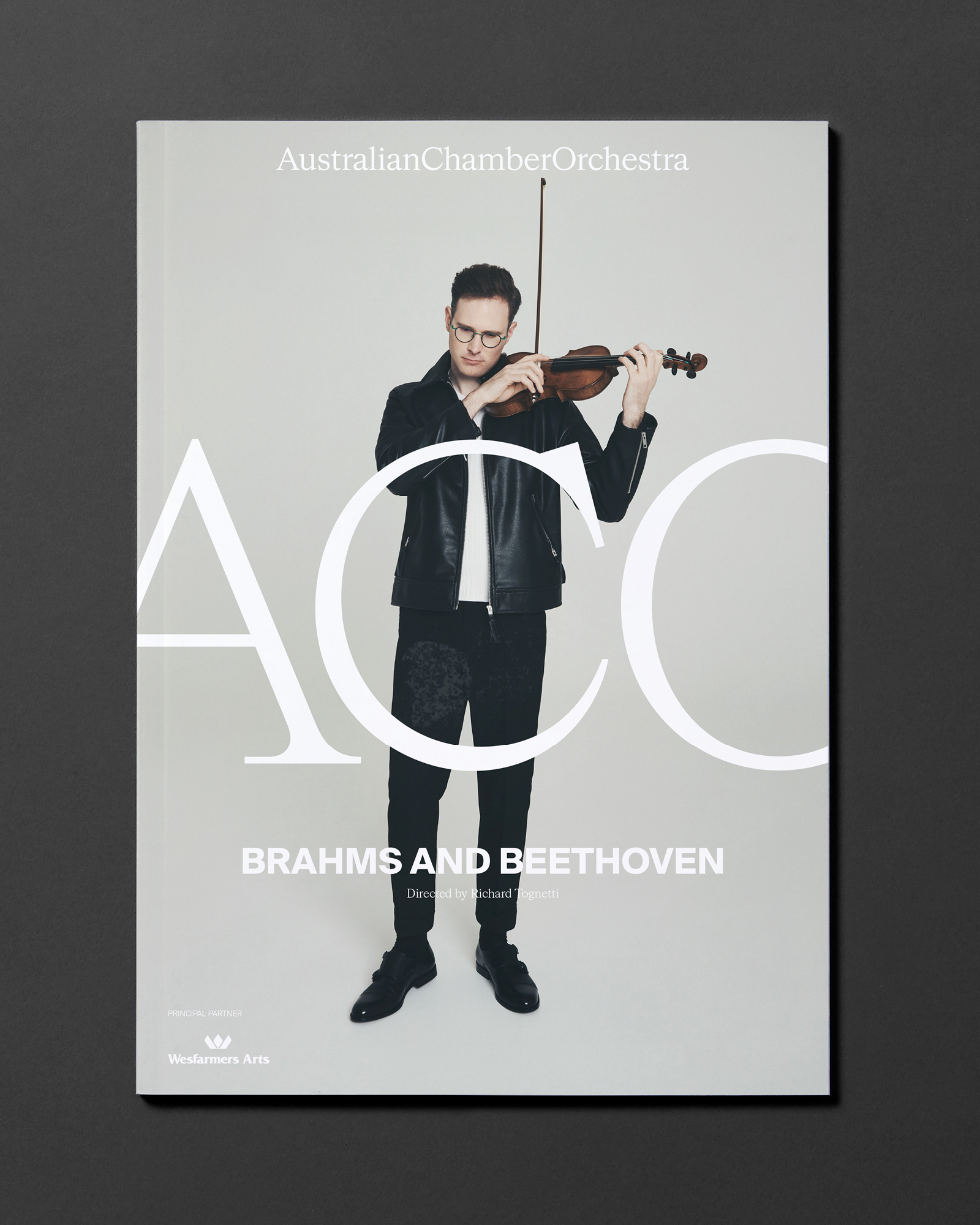
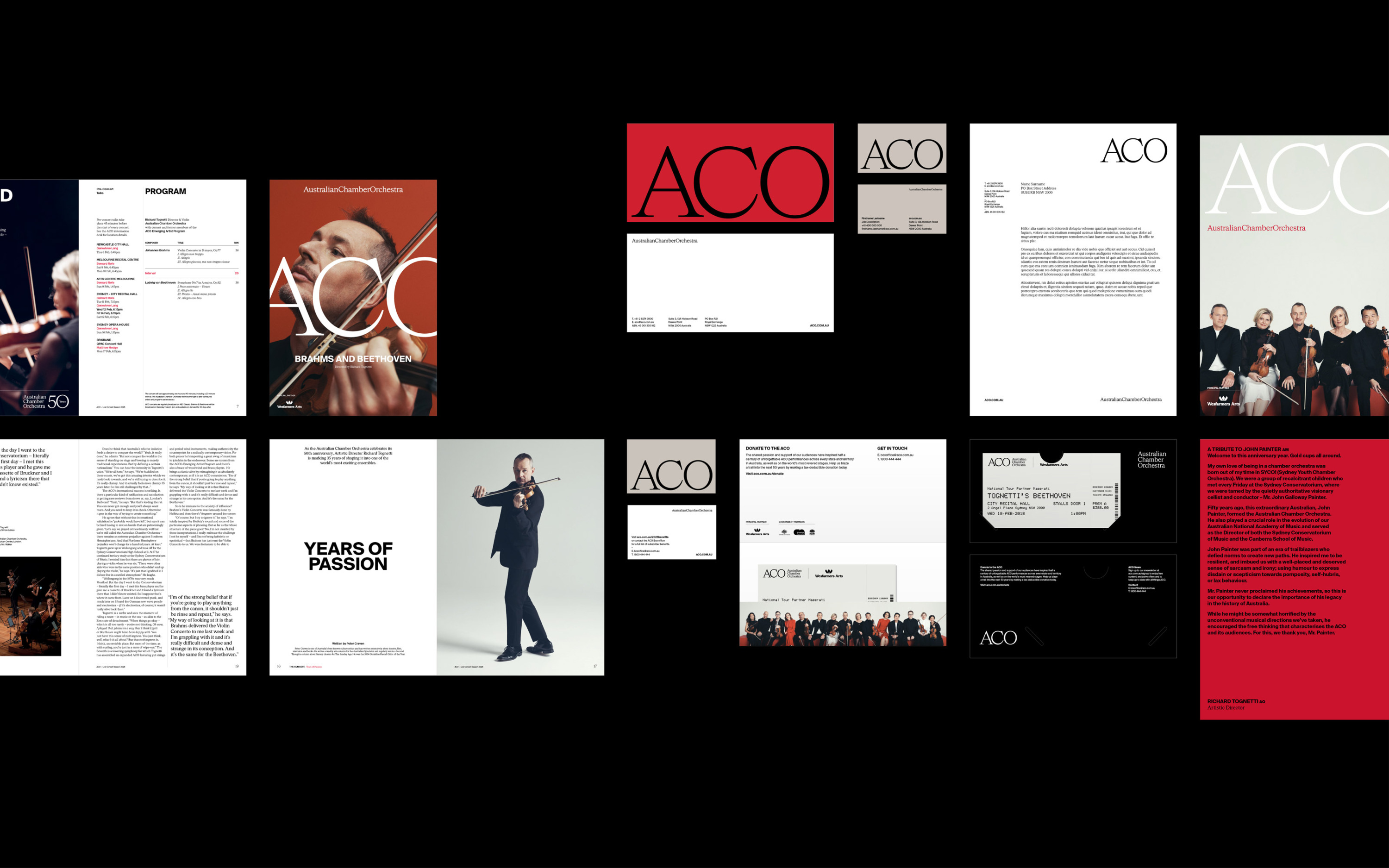
In their 50th year, the Australian Chamber Orchestra approached us to help define what the next decade could look and feel like. As long-term collaborators, we partnered with the ACO team to revitalise their brand strategy and identity—clarifying their direction while honouring their legacy.
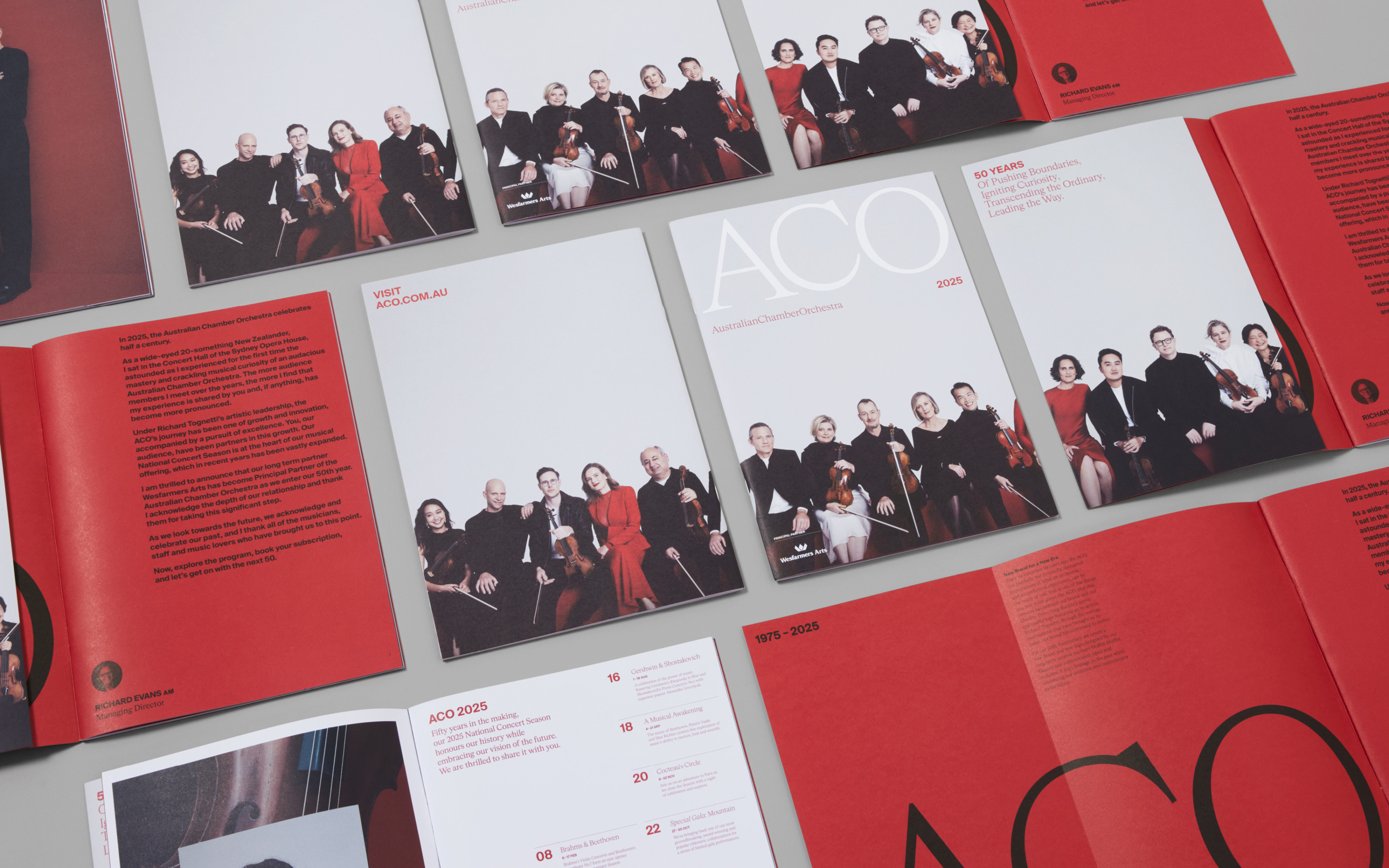
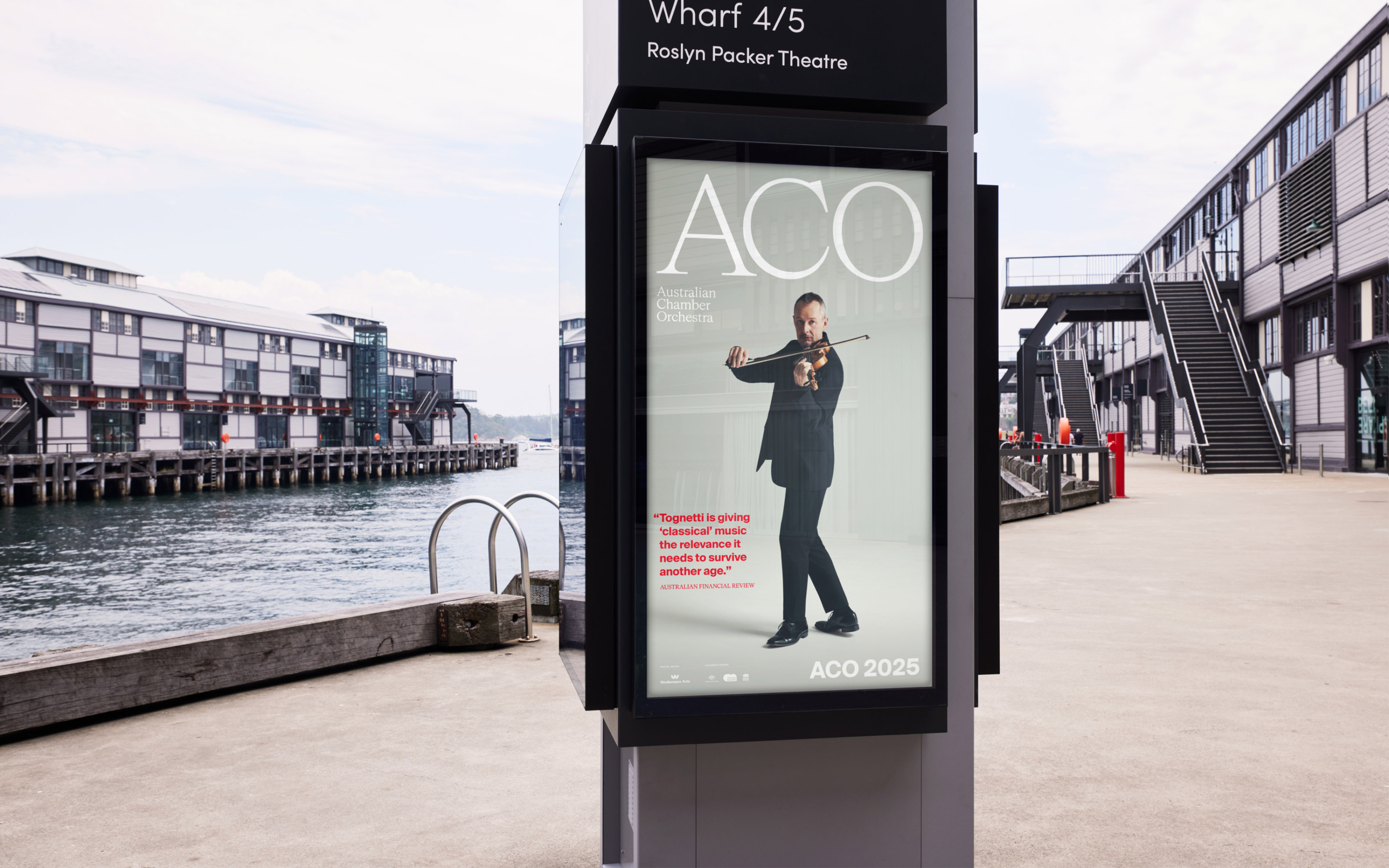
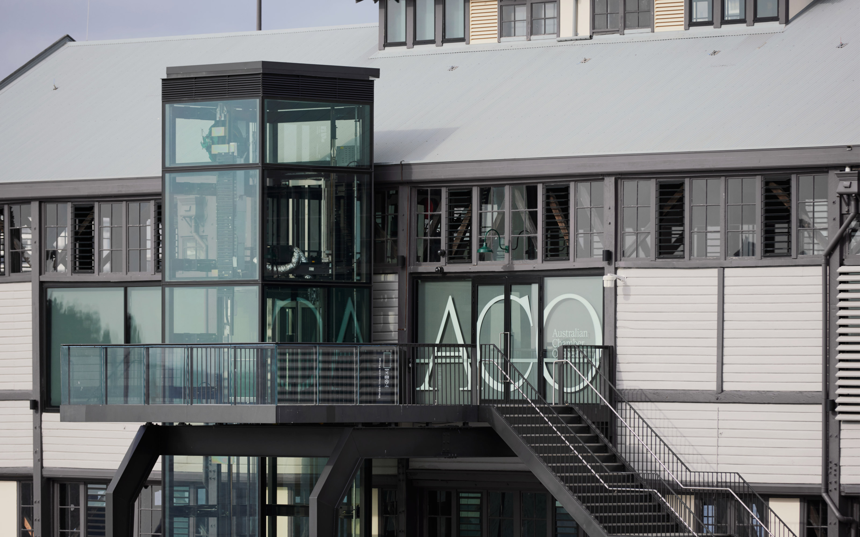
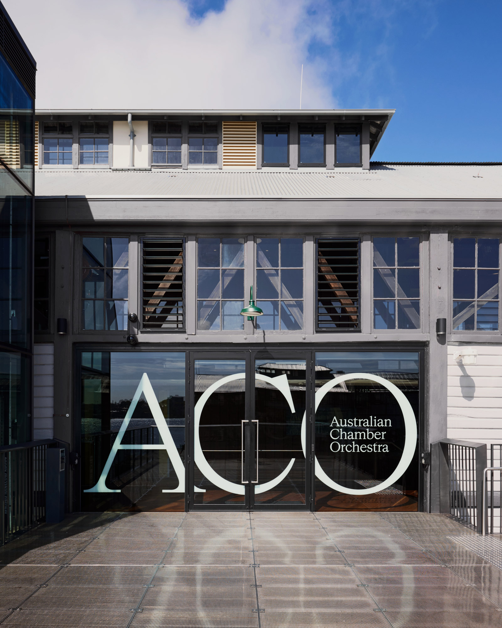
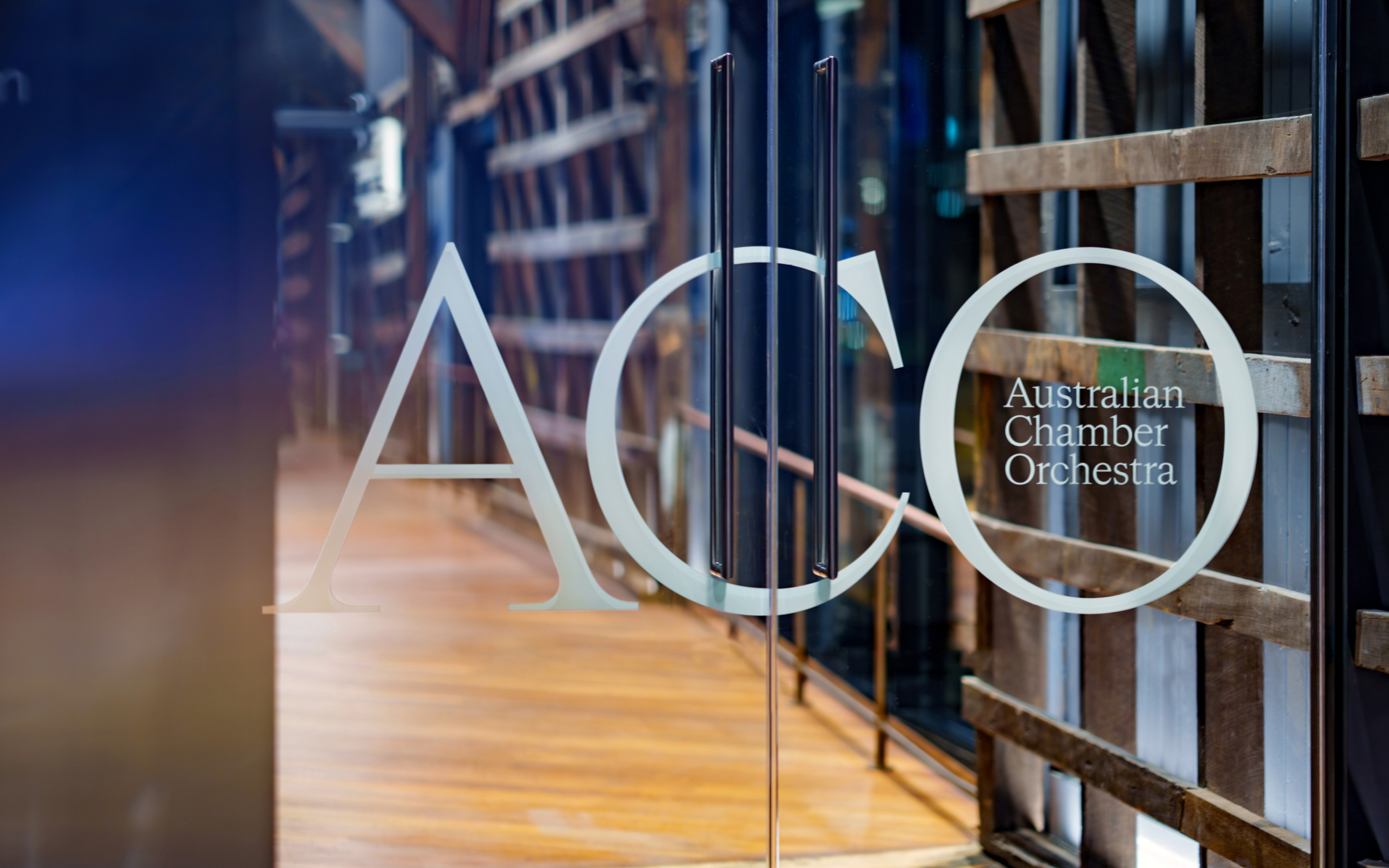
A key part of the process involved working closely with all areas of the organisation—including the executive team, artistic leadership, and musicians—to align perspectives and shape a brand strategy that could guide the ACO’s evolution over the next ten years. This work also included the development of a new brand architecture: a clear and cohesive framework to support their sub-brands, programs and destinations, particularly as they moved into their new home at Sydney’s Walsh Bay Arts Precinct.
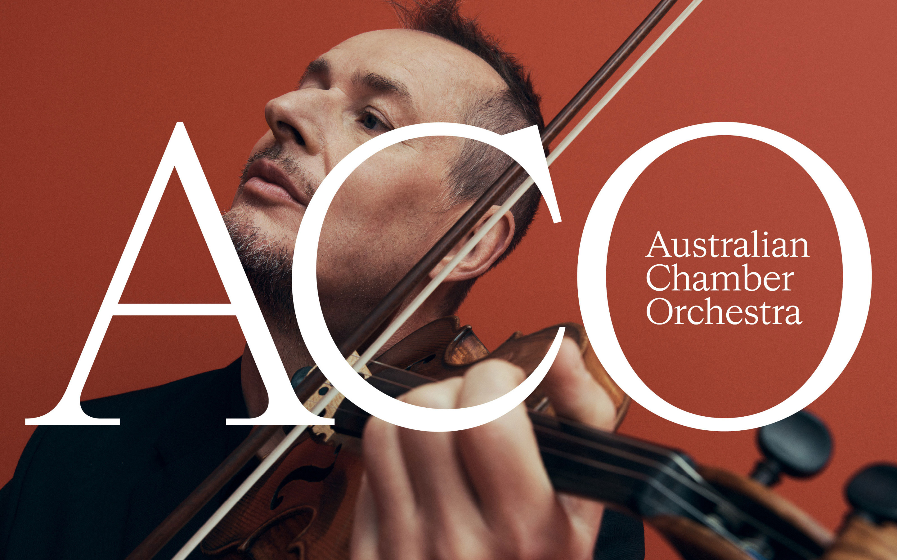
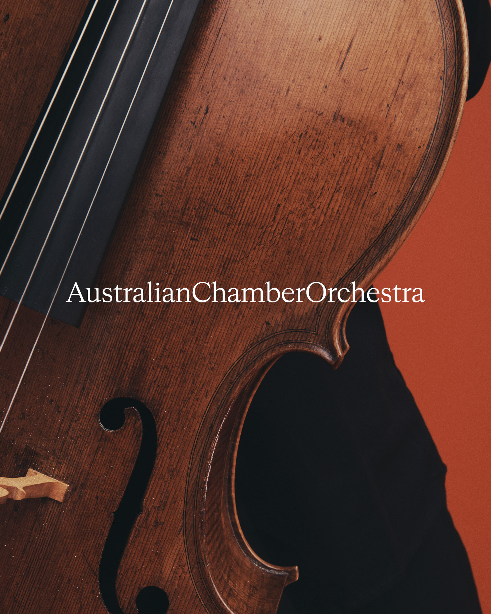
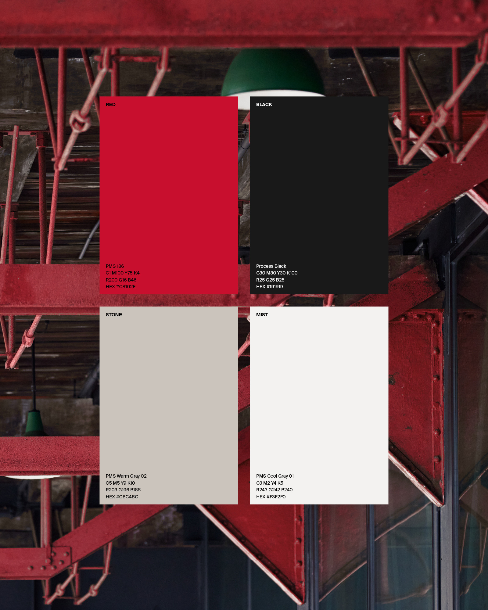
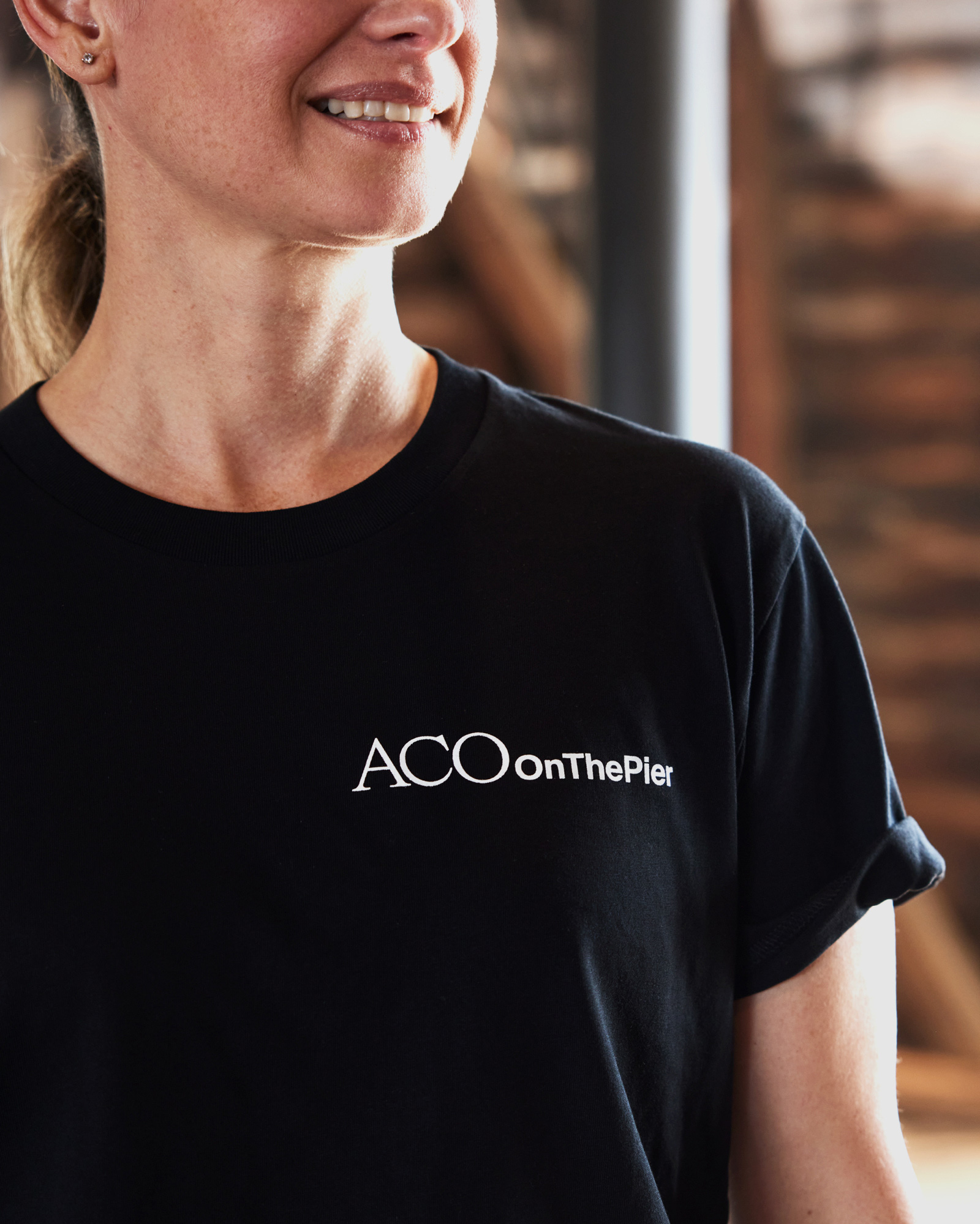
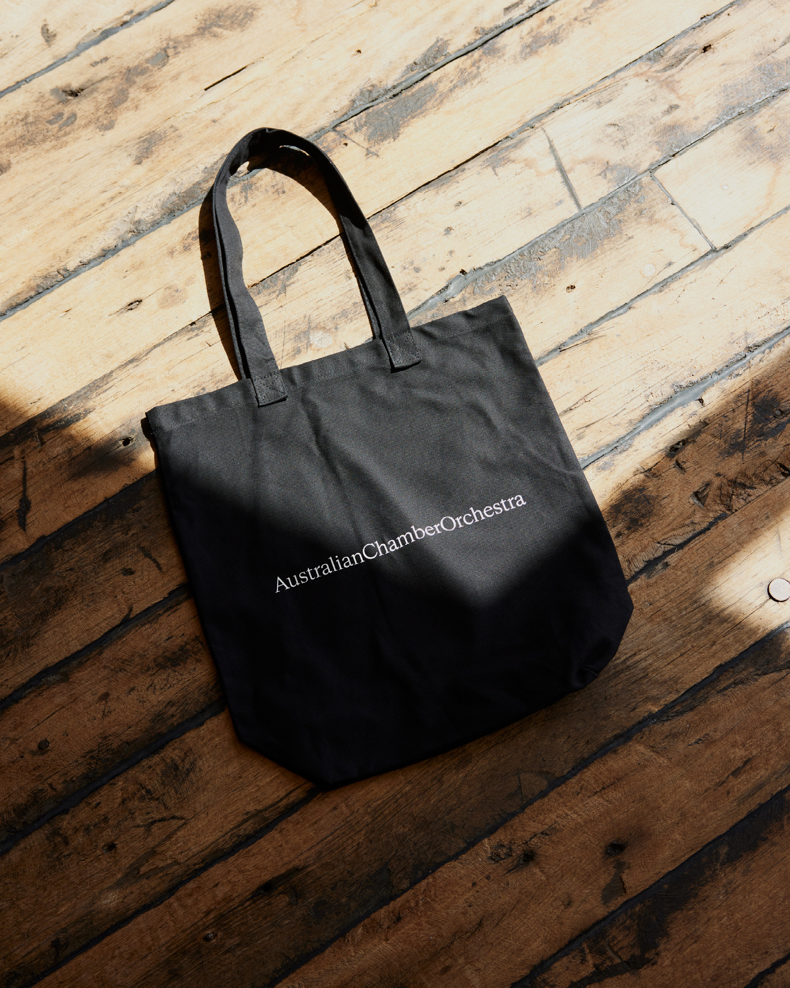
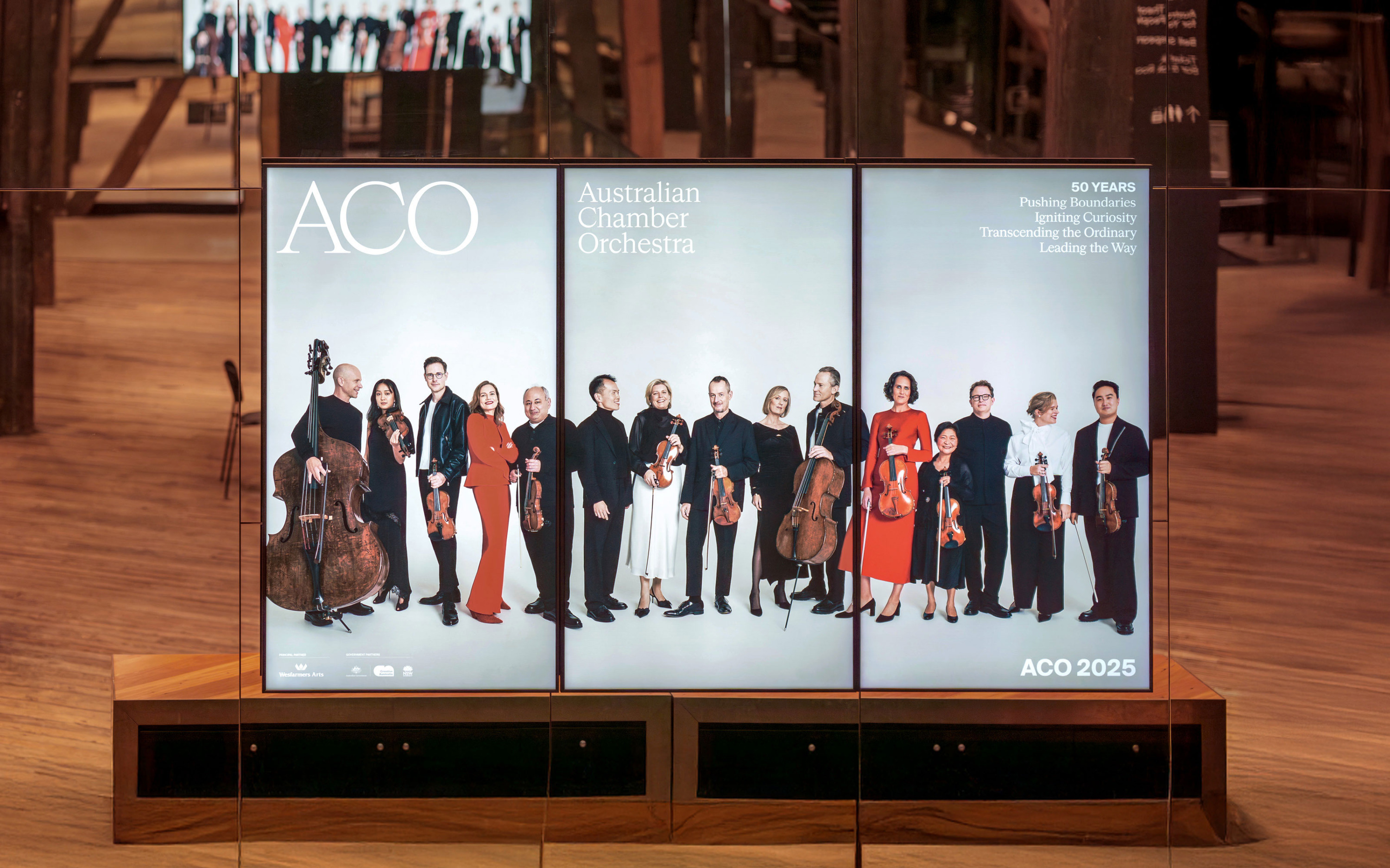
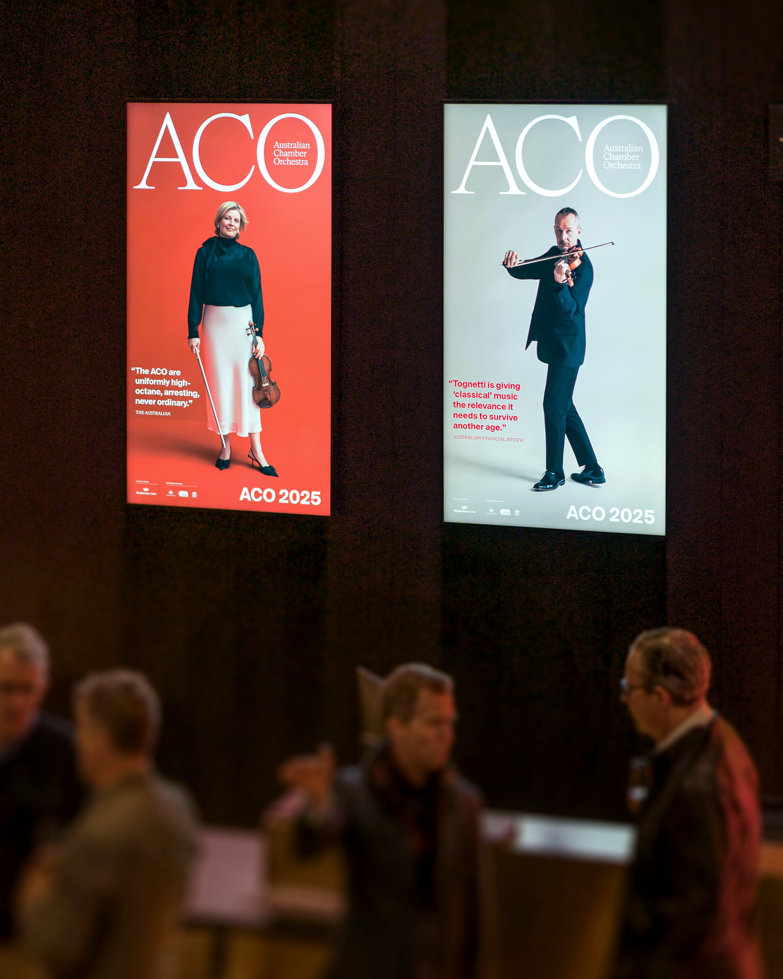
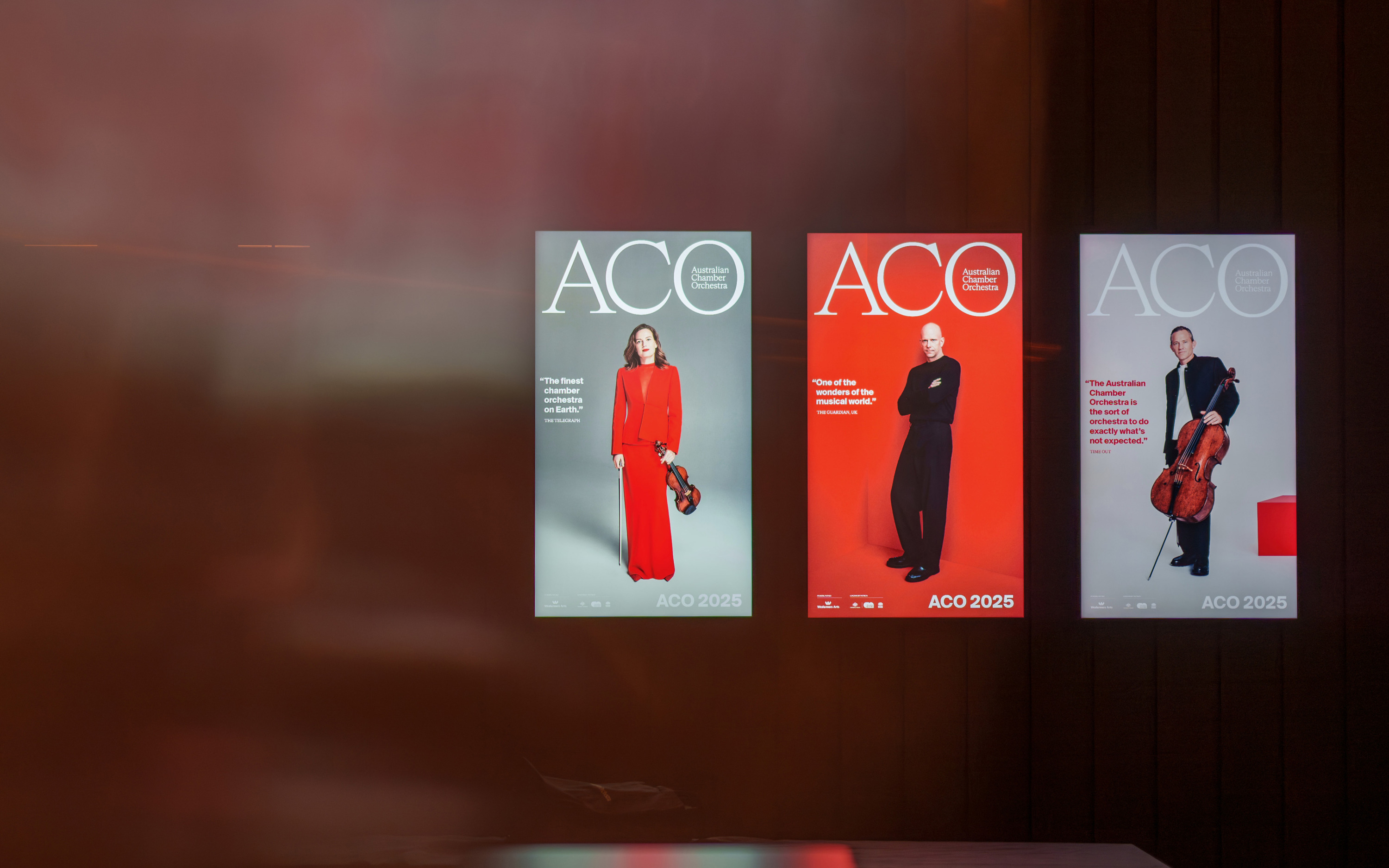
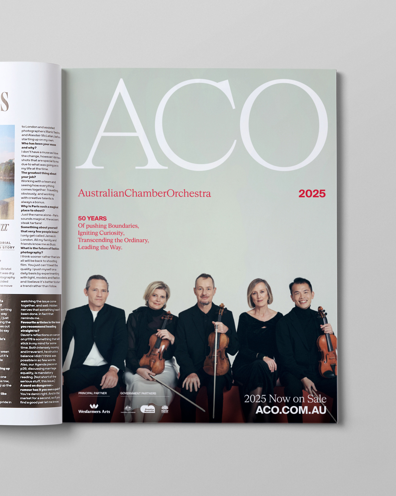
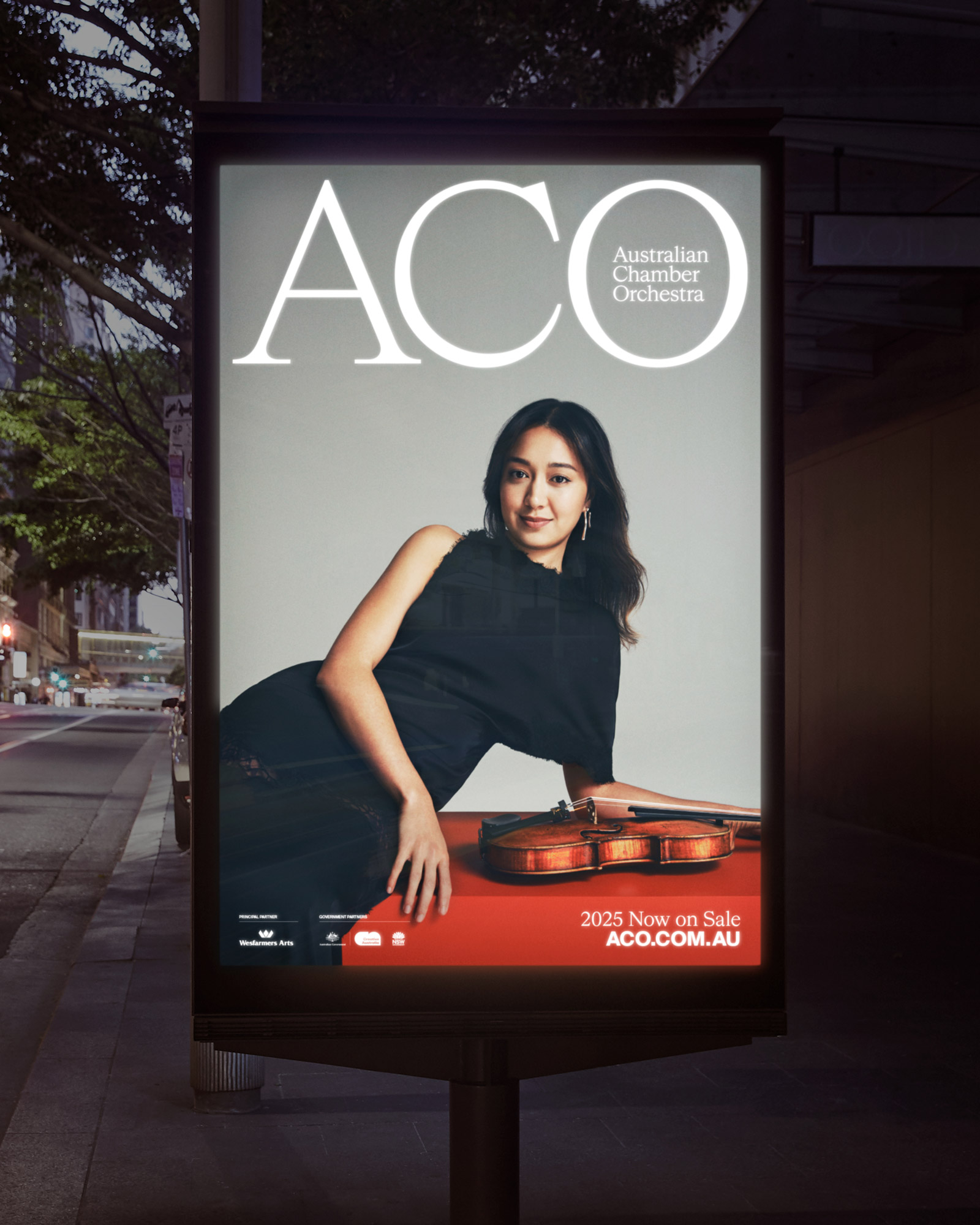
The revitalised identity strikes a balance between elegance and individual expression. The brandmark, with its confident stature, fluid lines and sense of openness, reflects both the prestige and accessibility of the Orchestra. A contrasting typographic system—combining serif and sans serif forms—allows the brand to move effortlessly between bold and refined, timeless and contemporary.
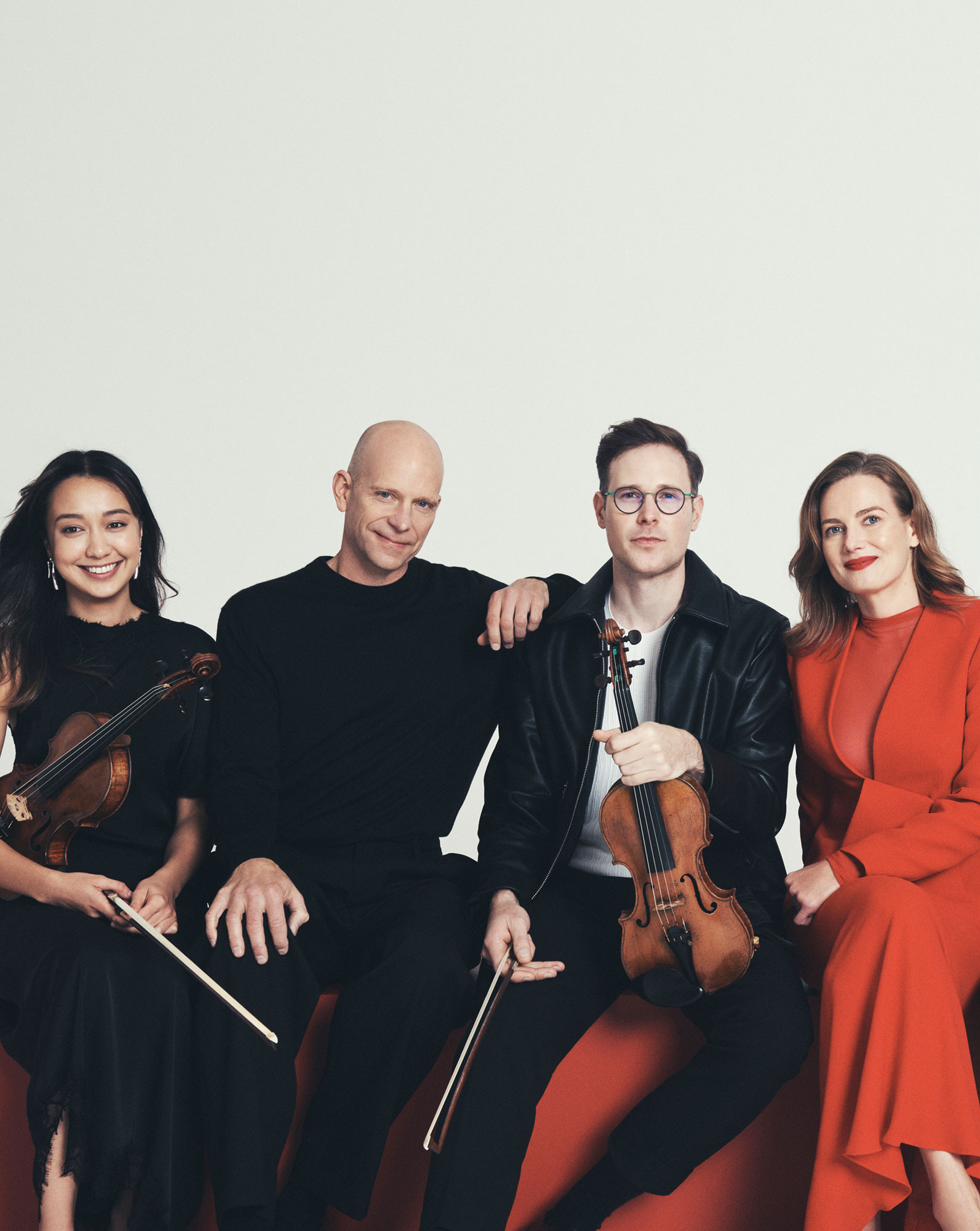
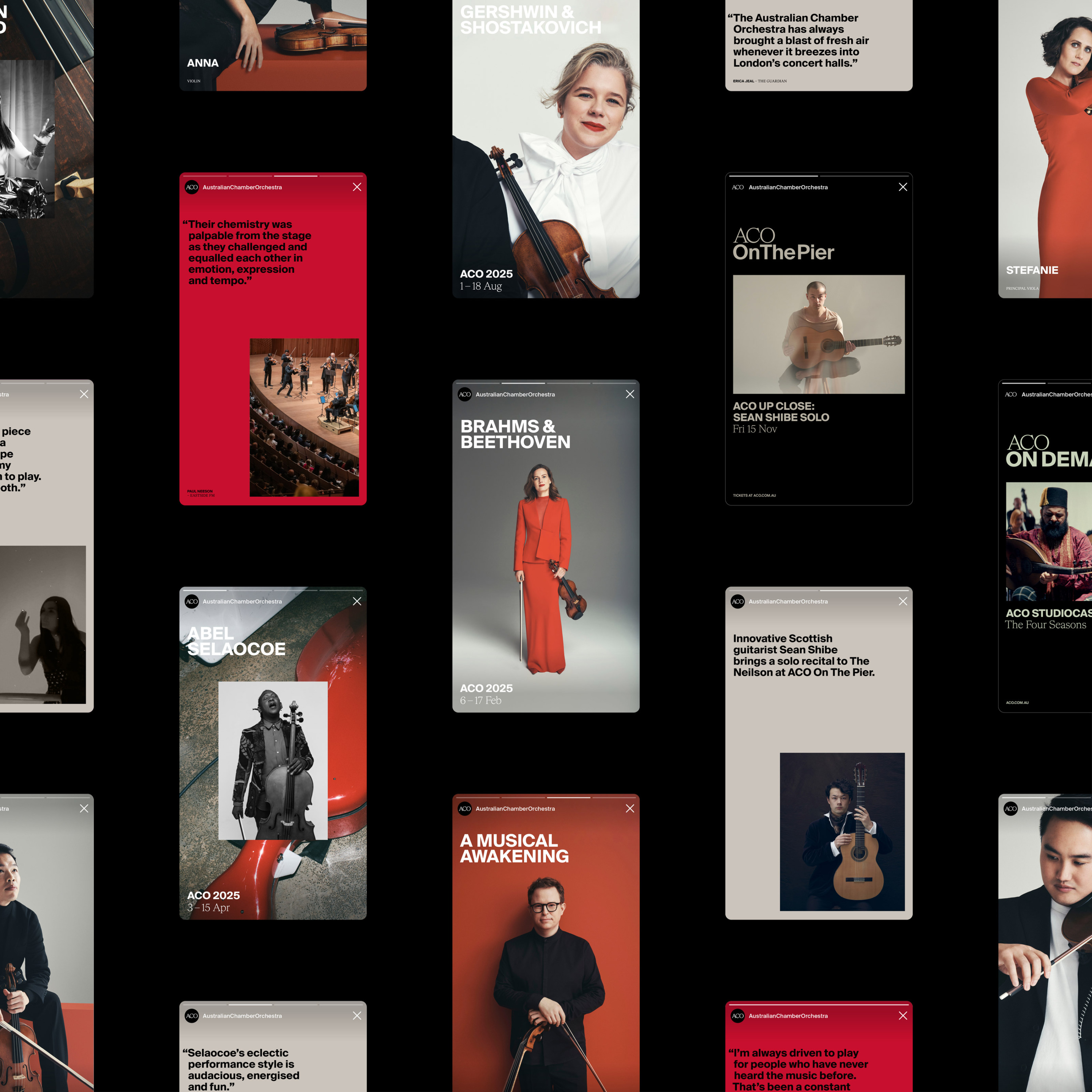
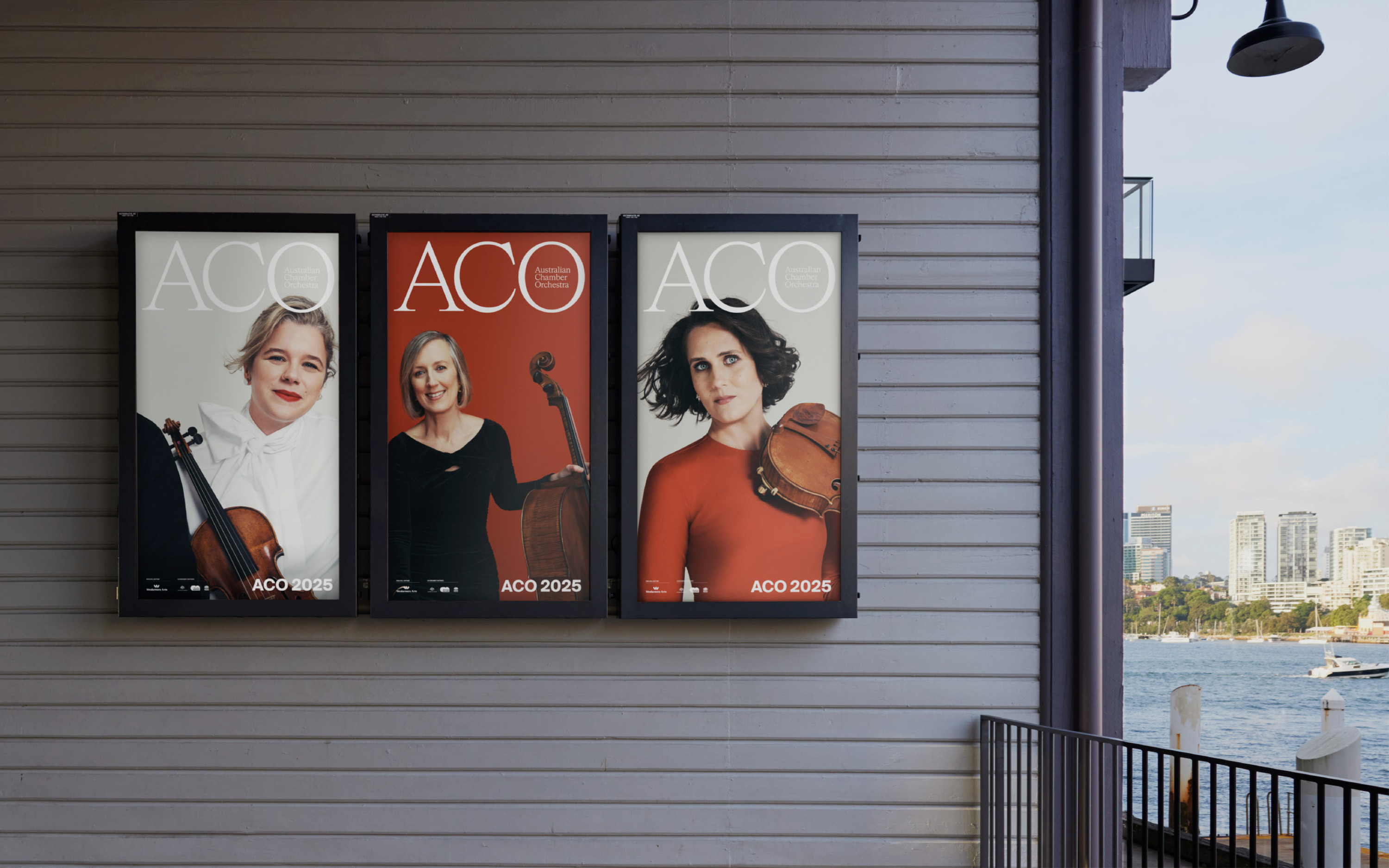
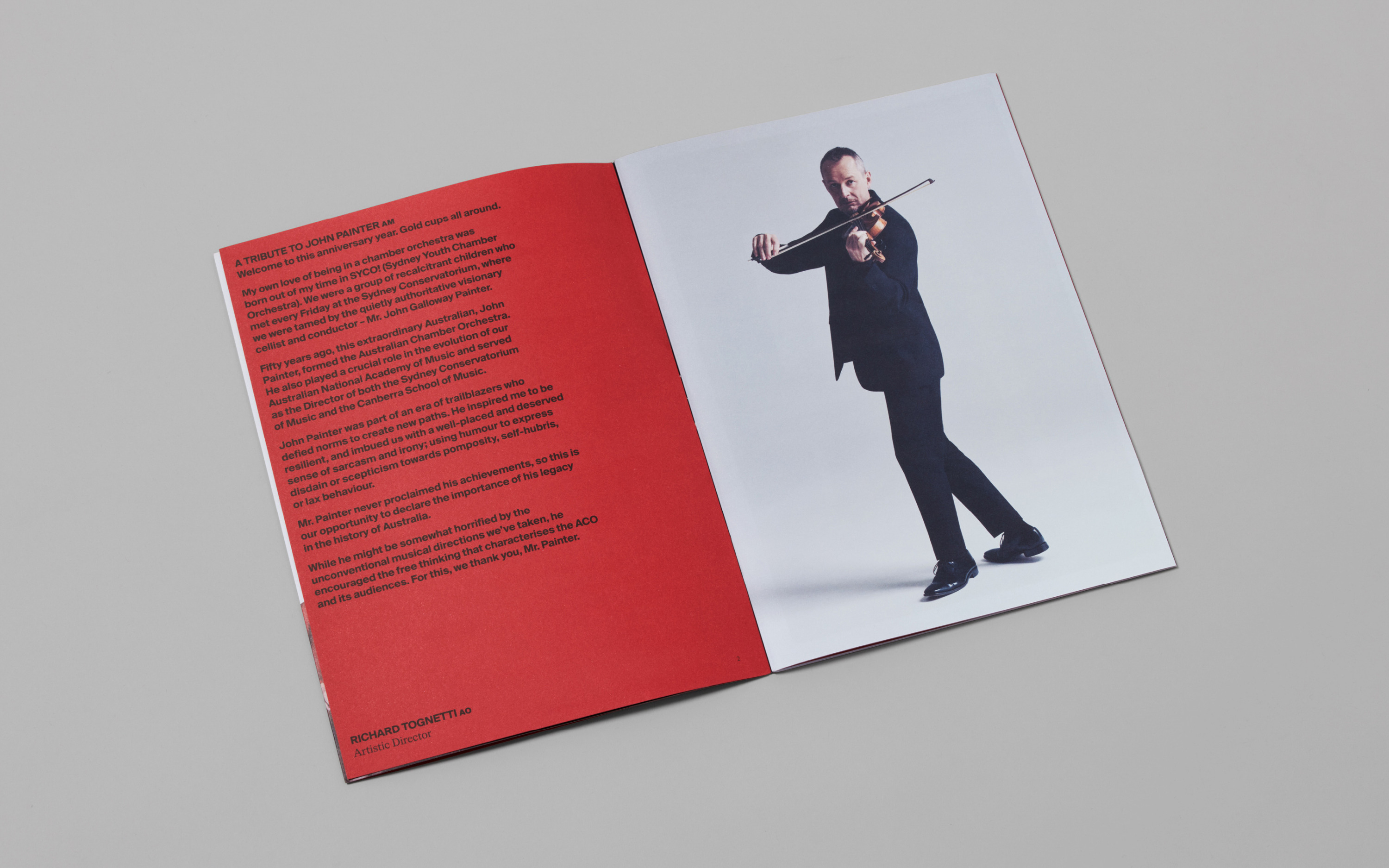
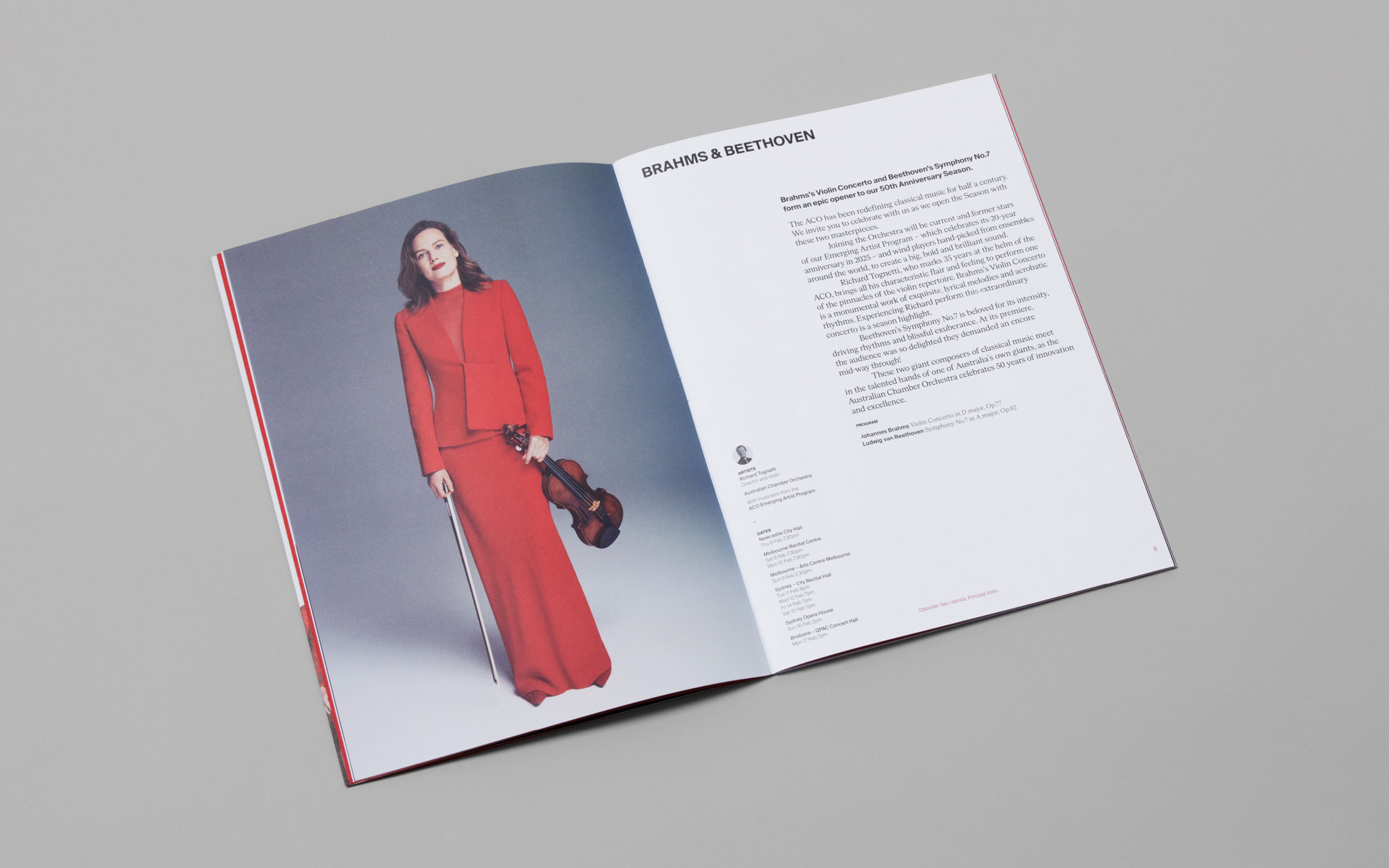
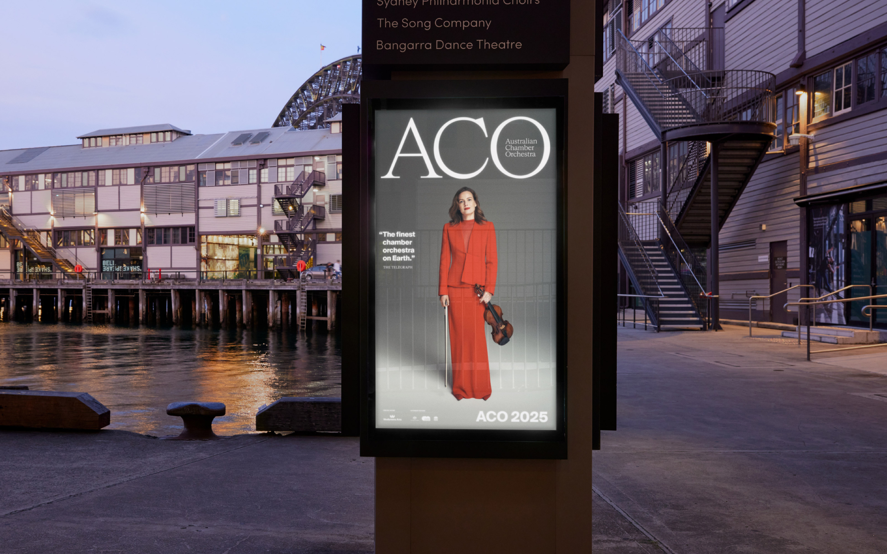
For the 2025 Season campaign, we brought this thinking to life through a visual language that celebrates both heritage and possibility. Set against the ACO’s signature red backdrop, the campaign captures a cross-section of emerging and established musicians in moments of play, reflection and exhilaration—honouring the past while tuning into the energy of the future.
Photography. Simon Lekias