Australian Chamber Orchestra 2024
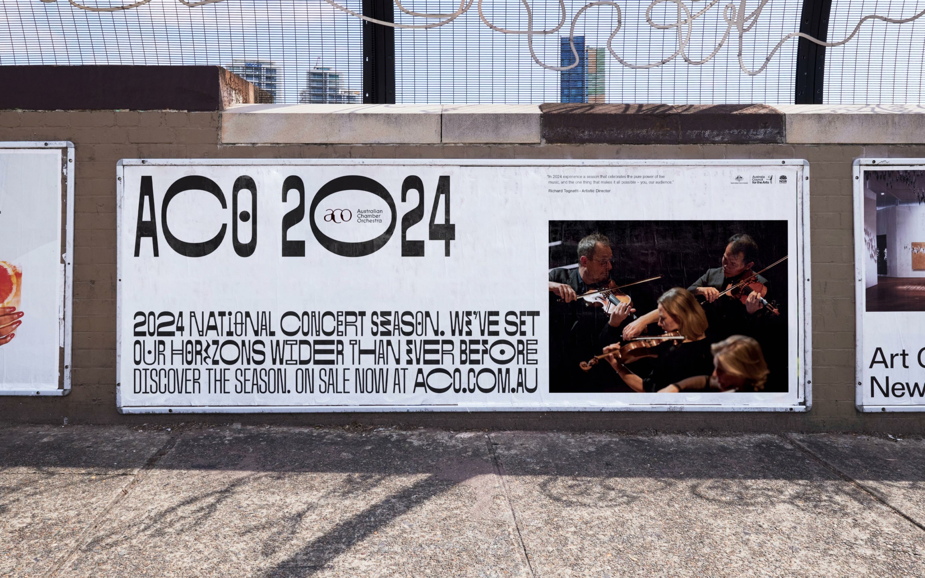
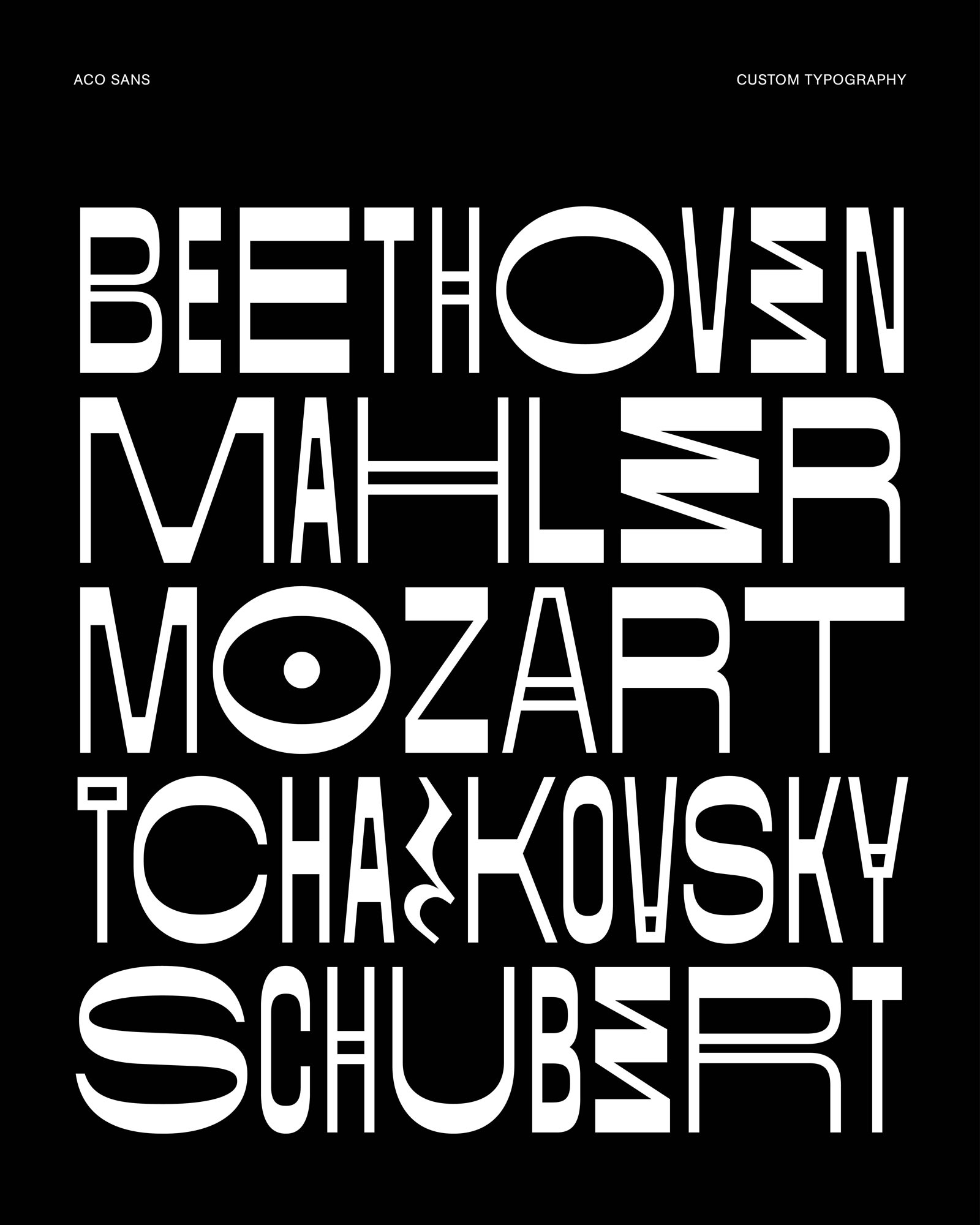
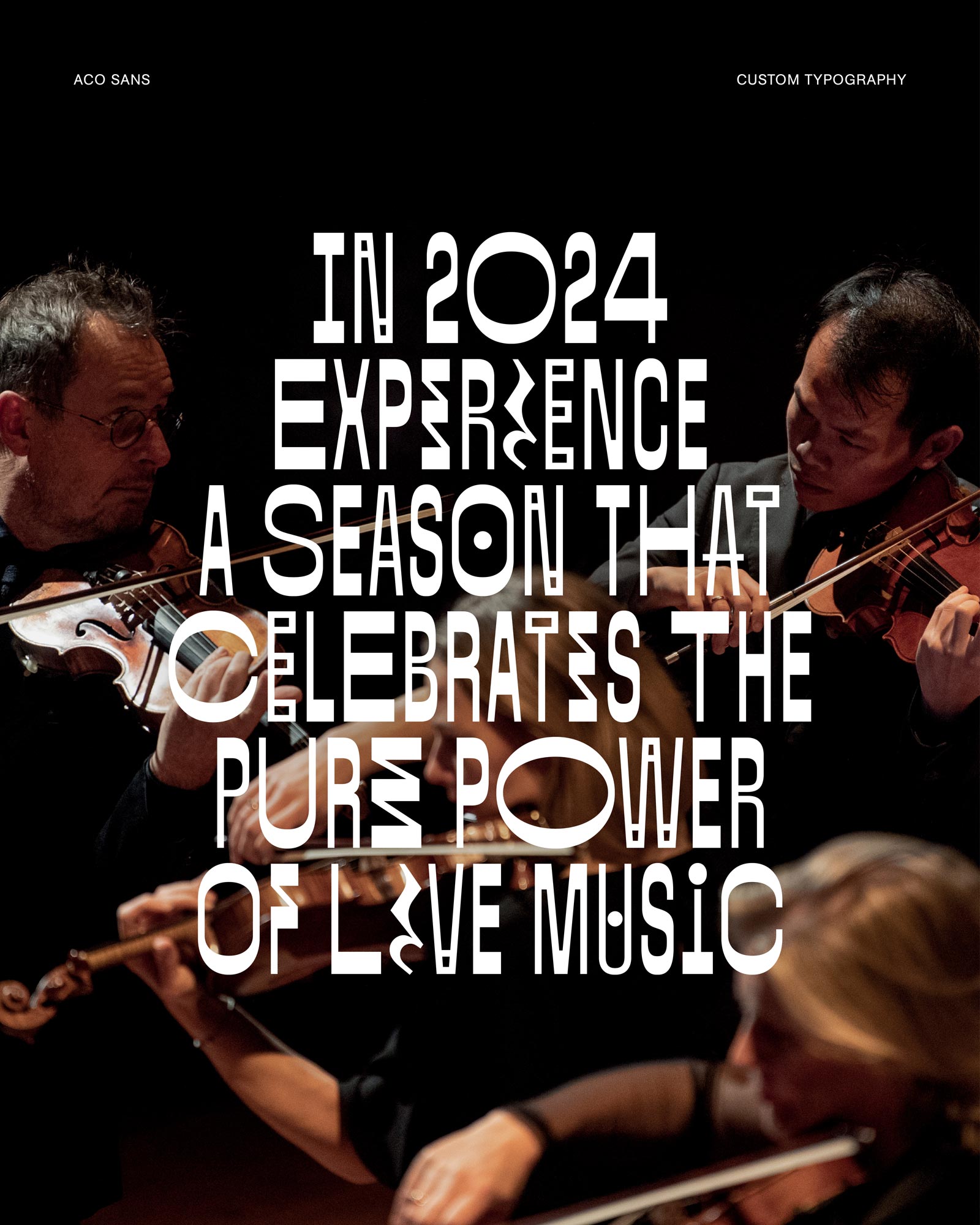
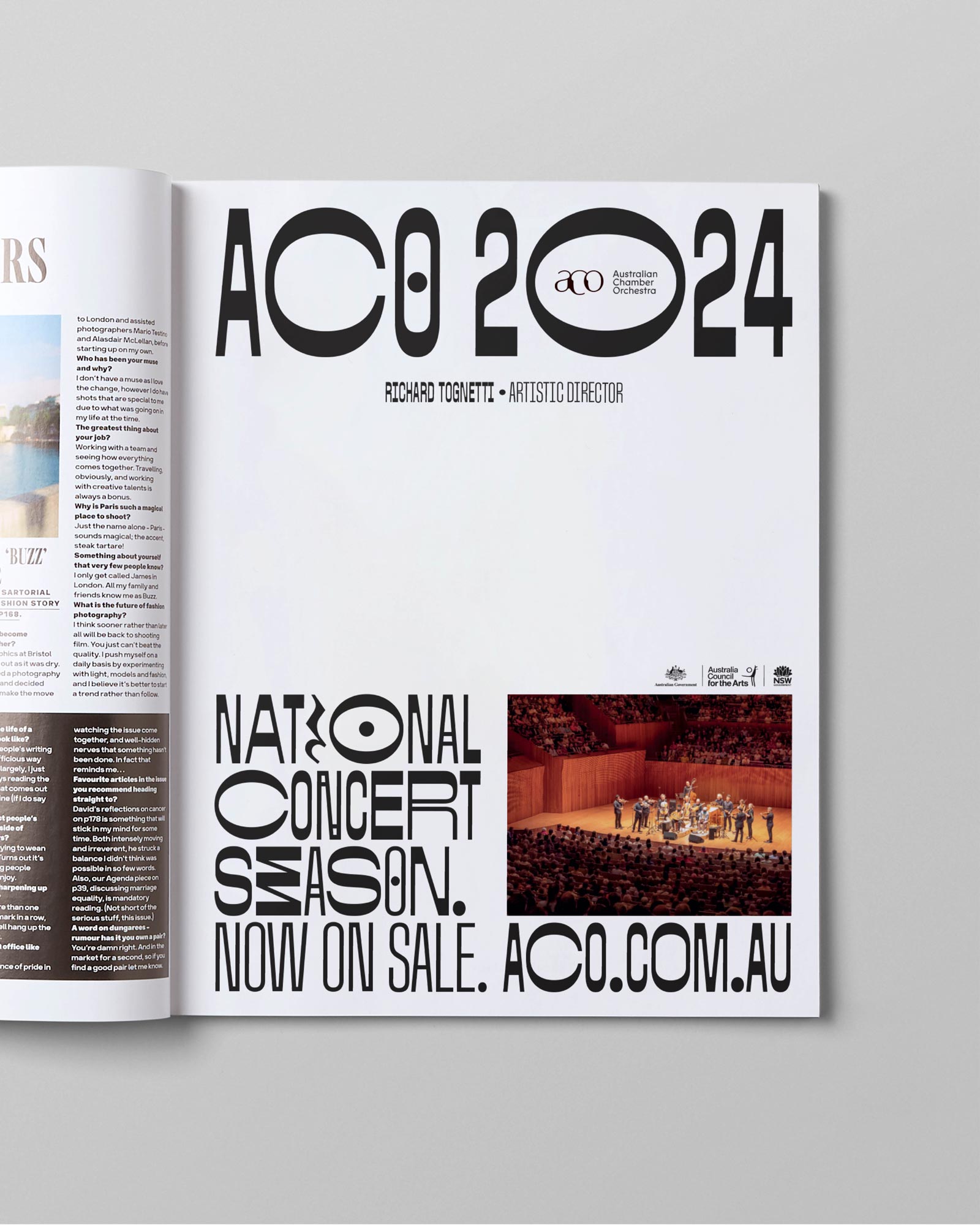
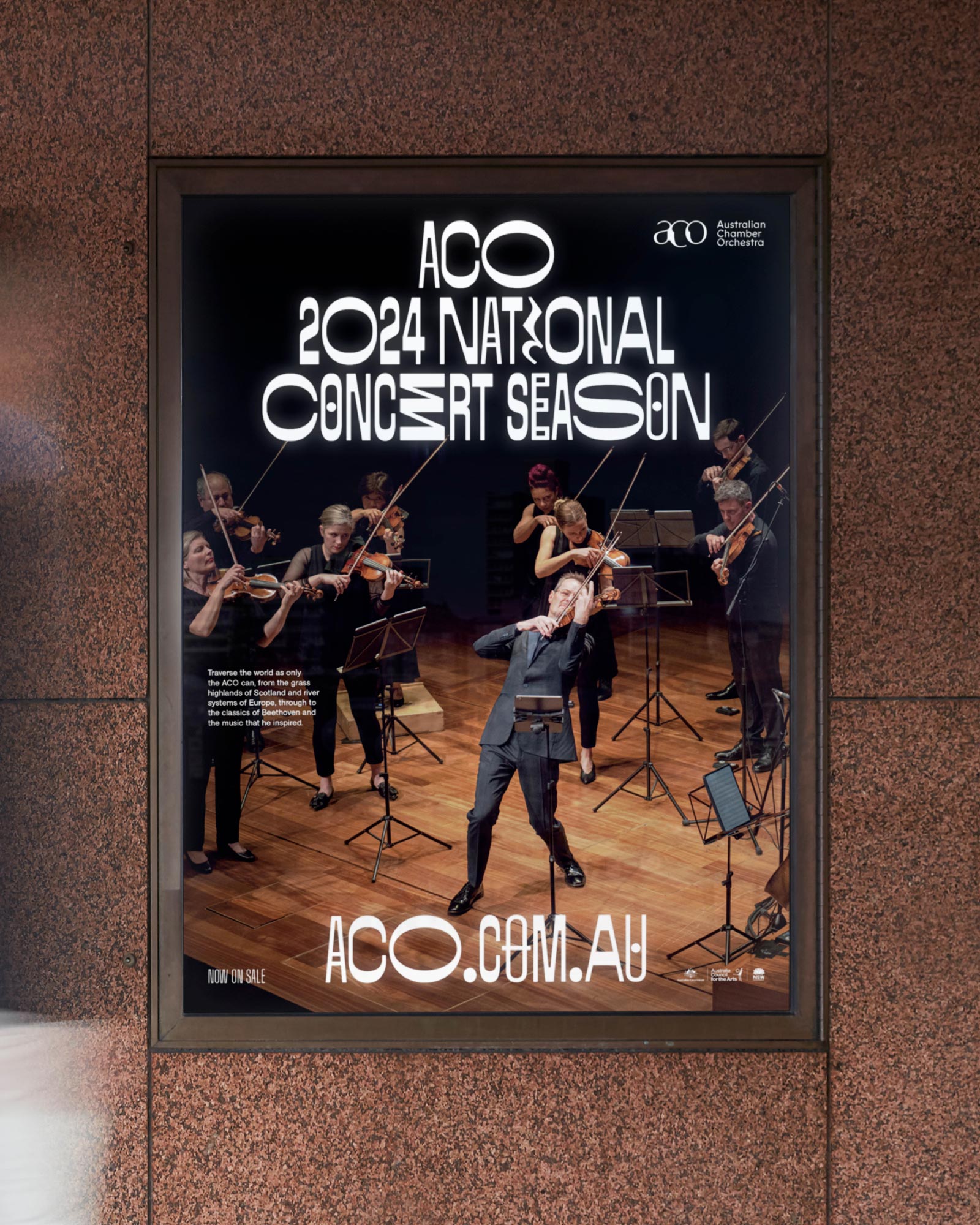
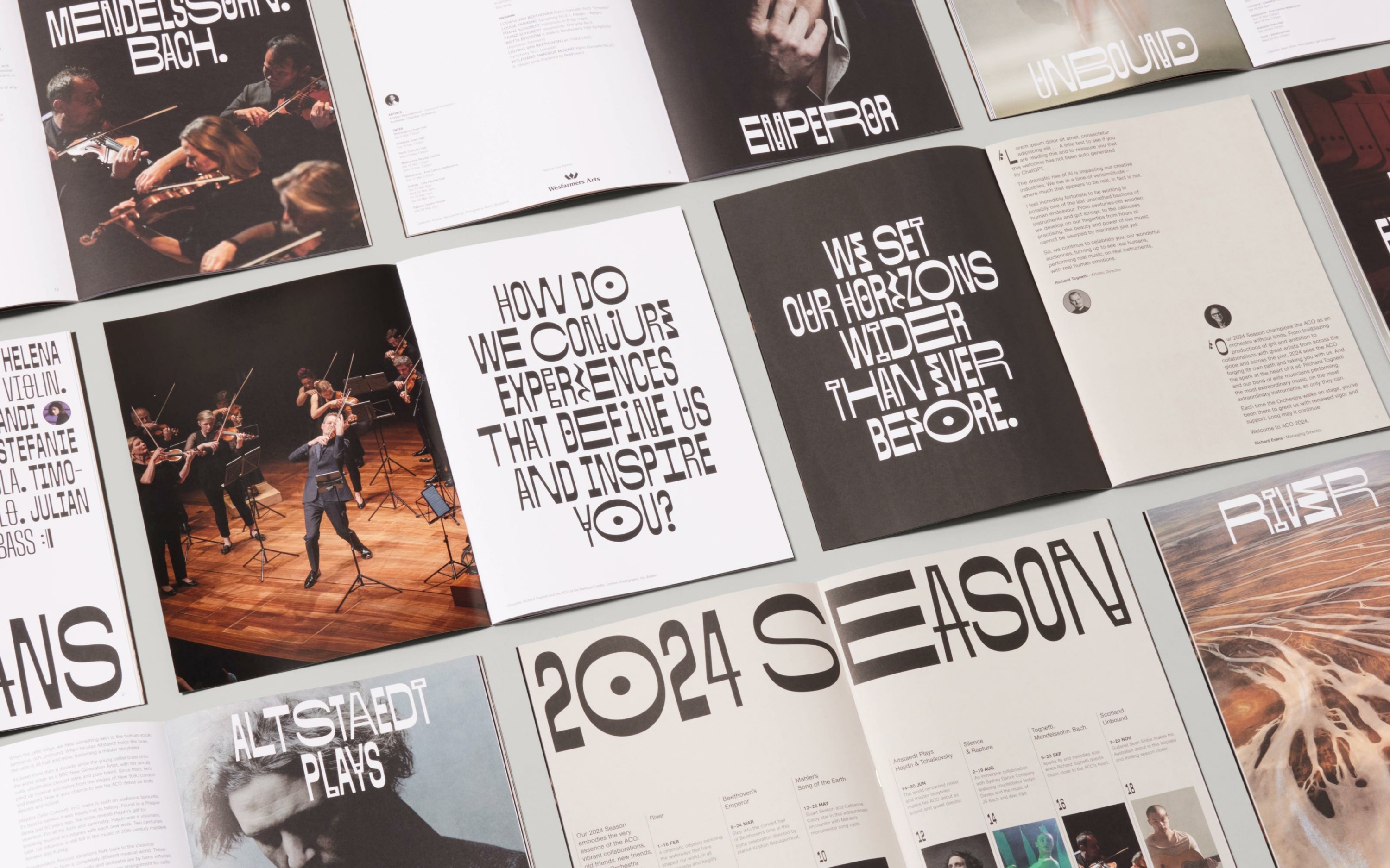
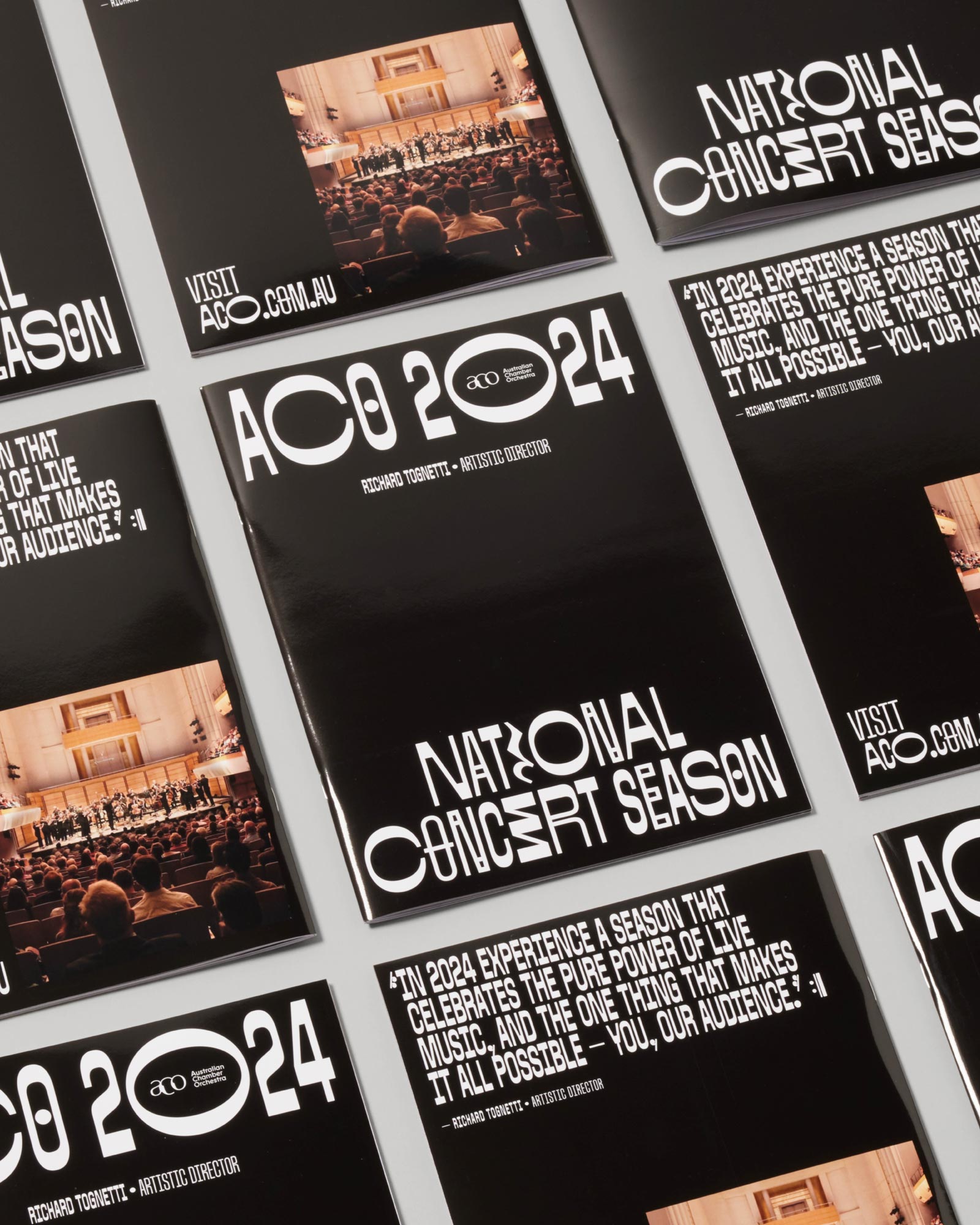
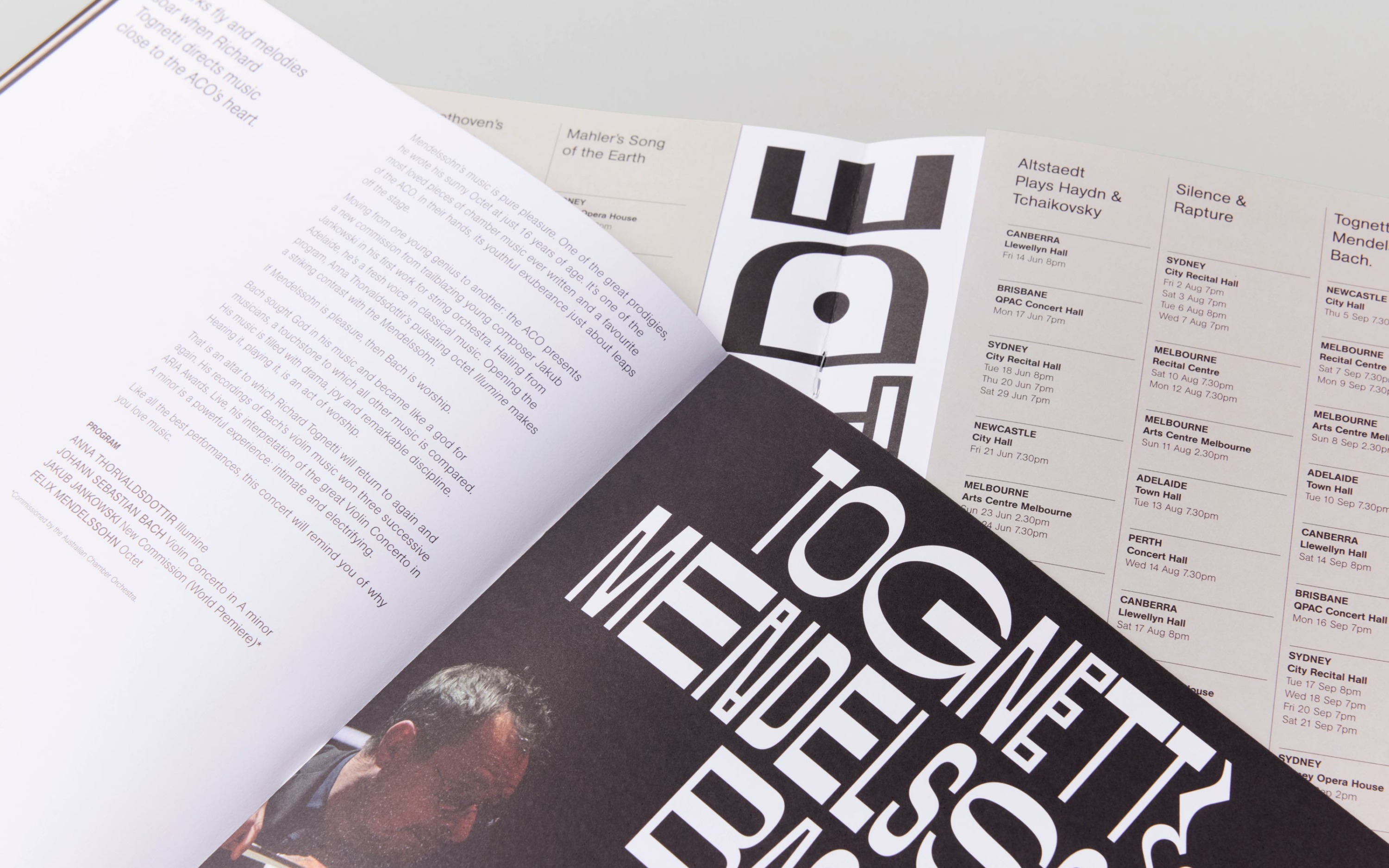
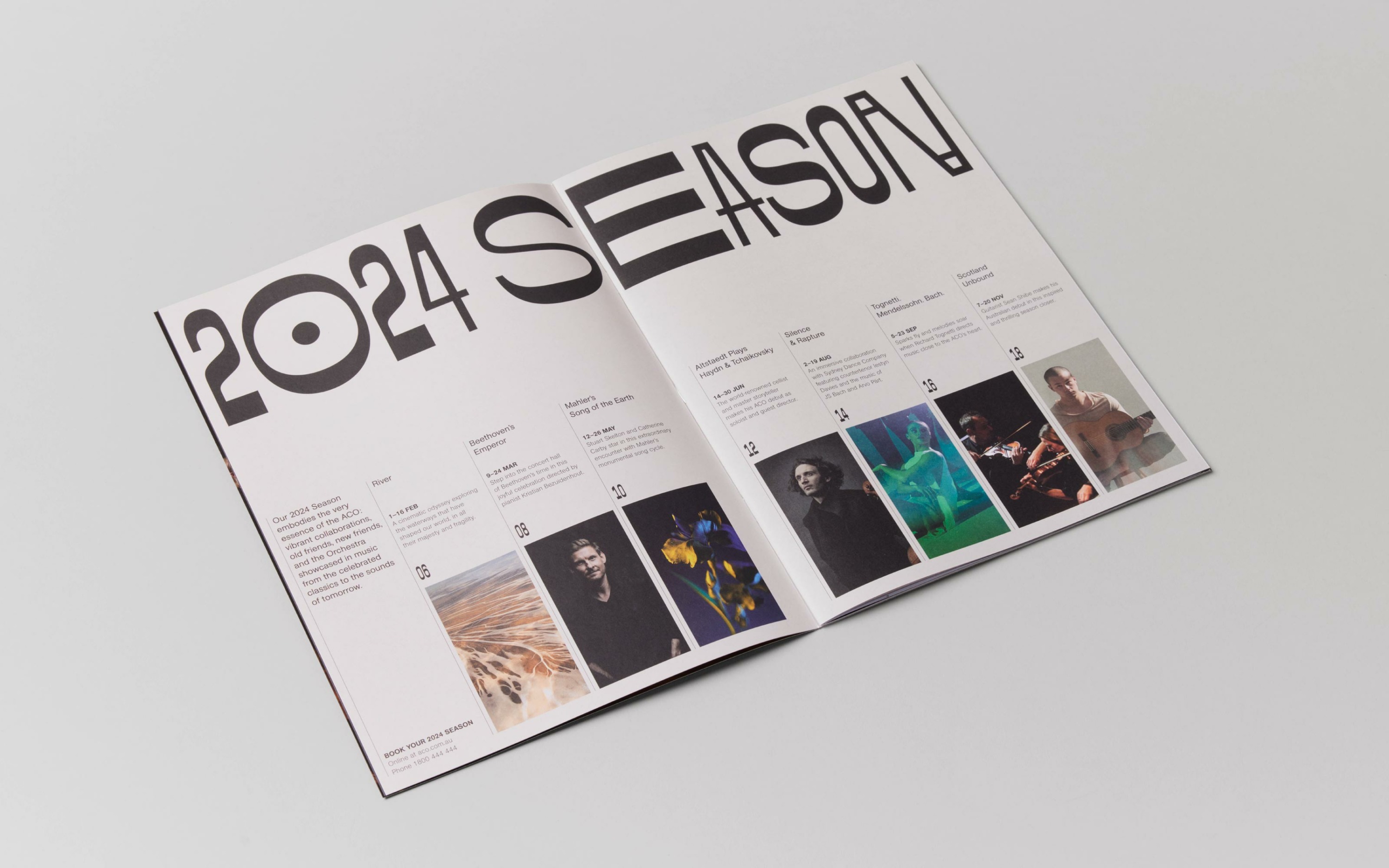
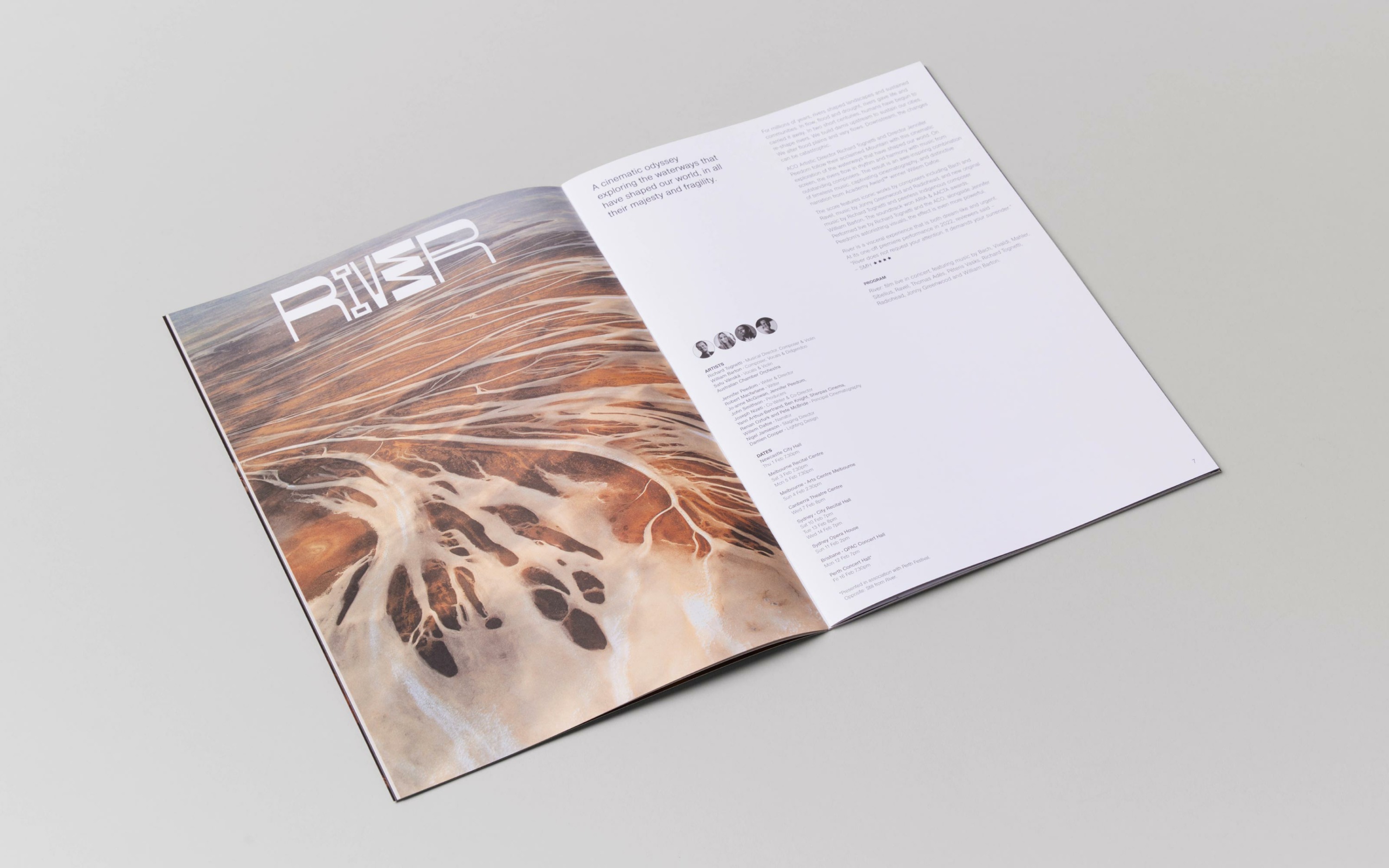
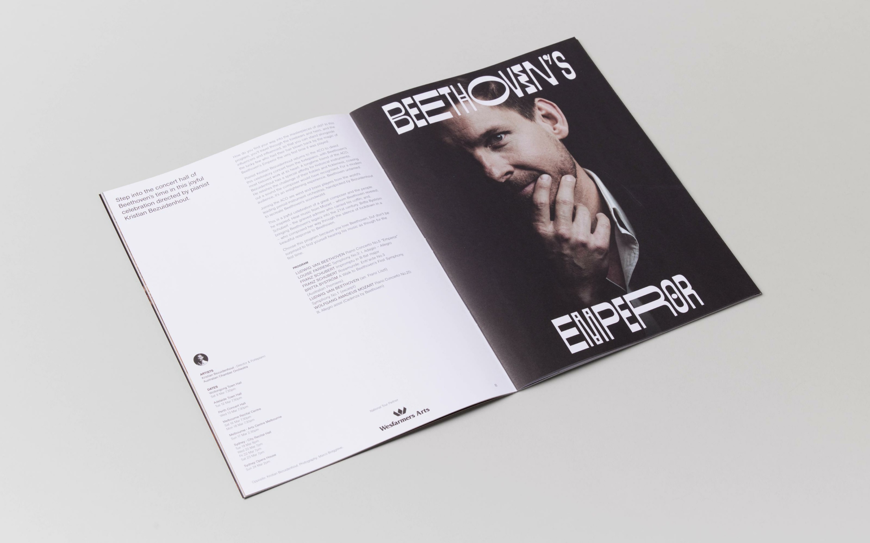
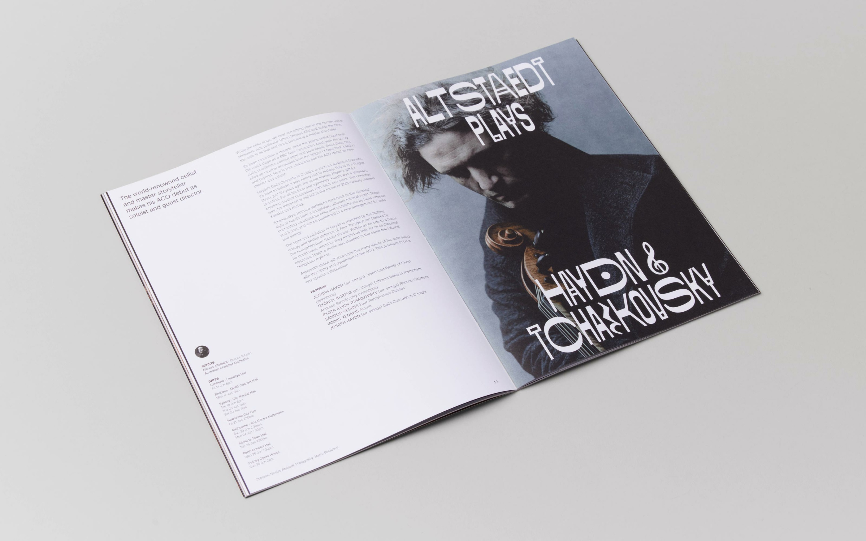
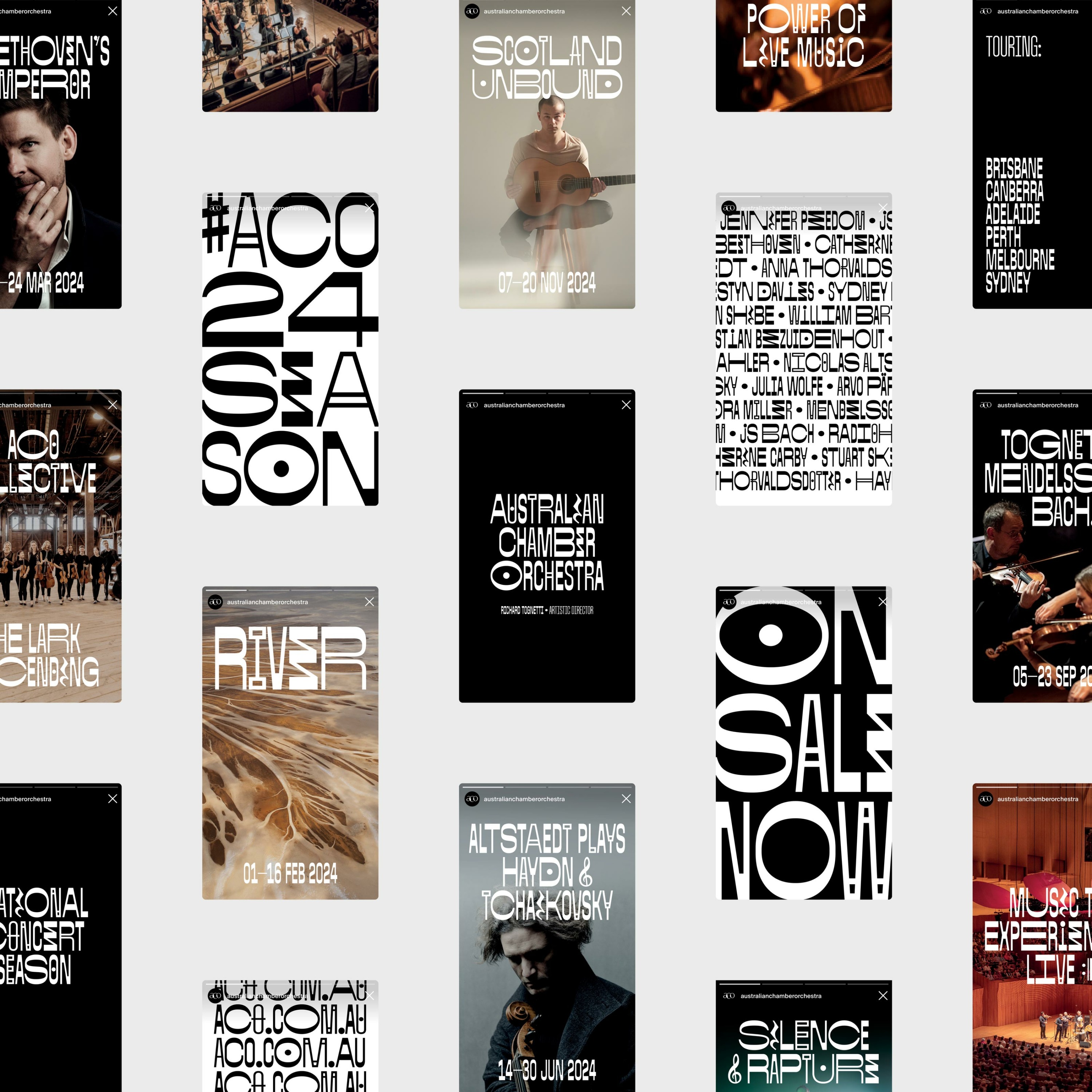
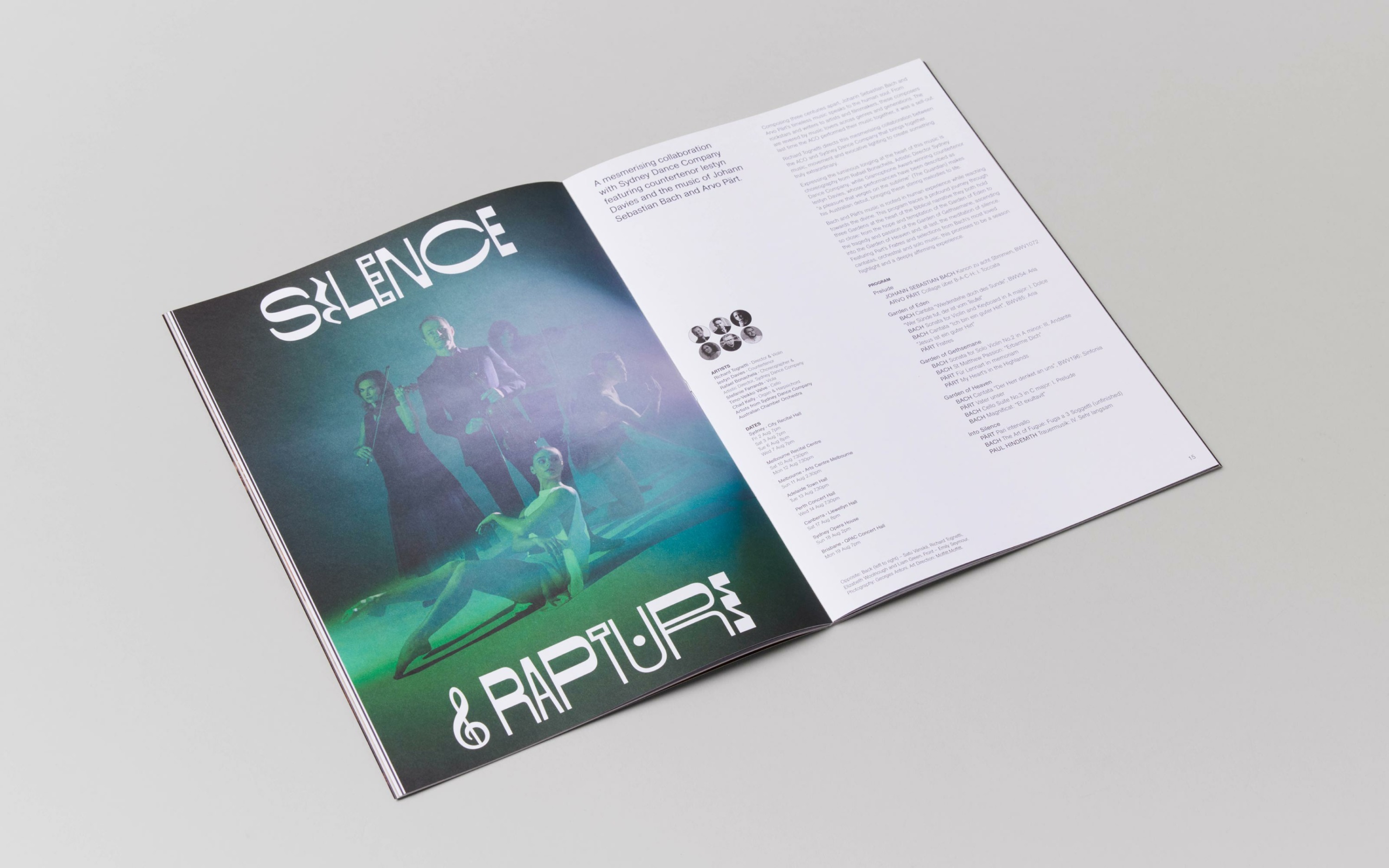
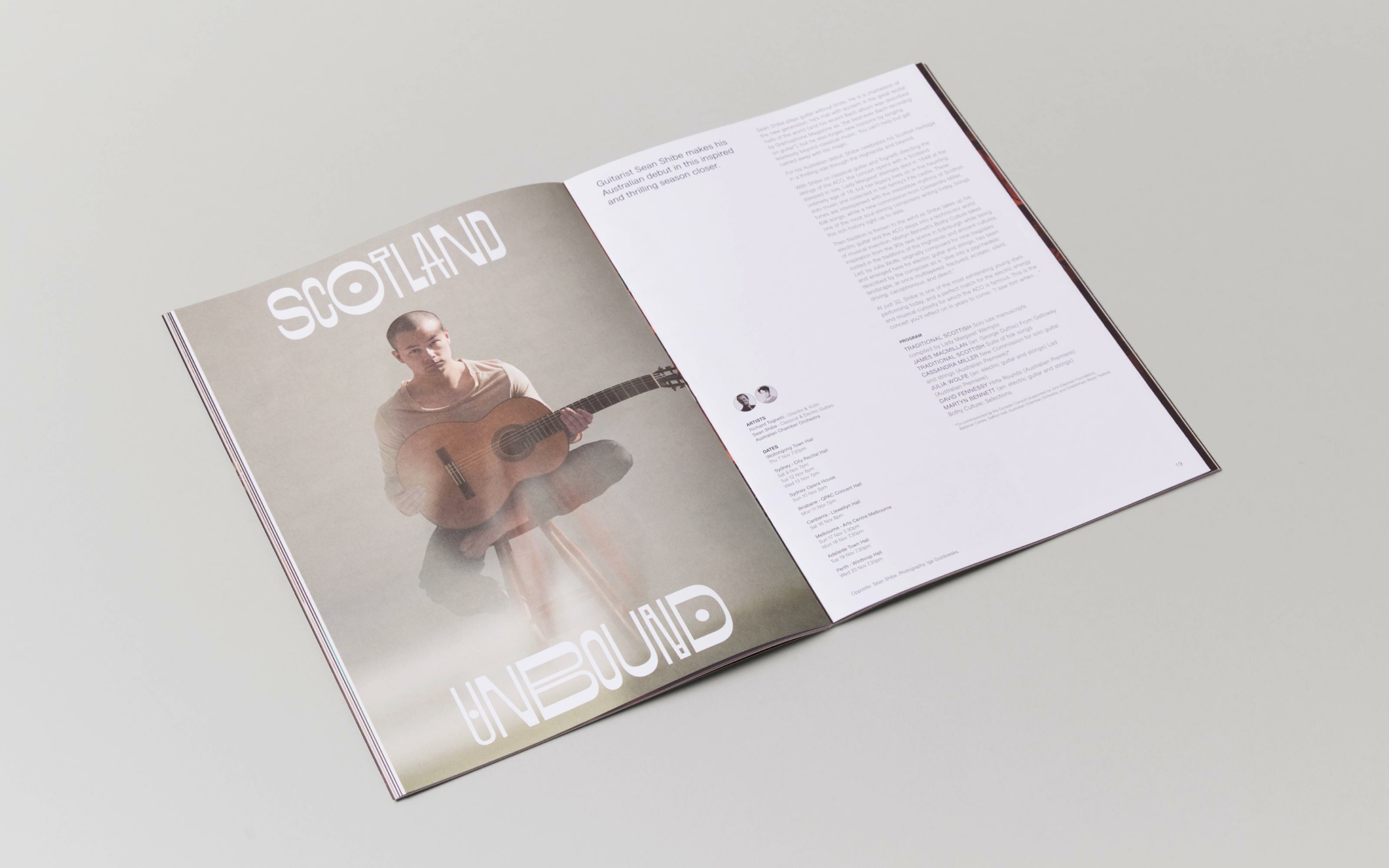
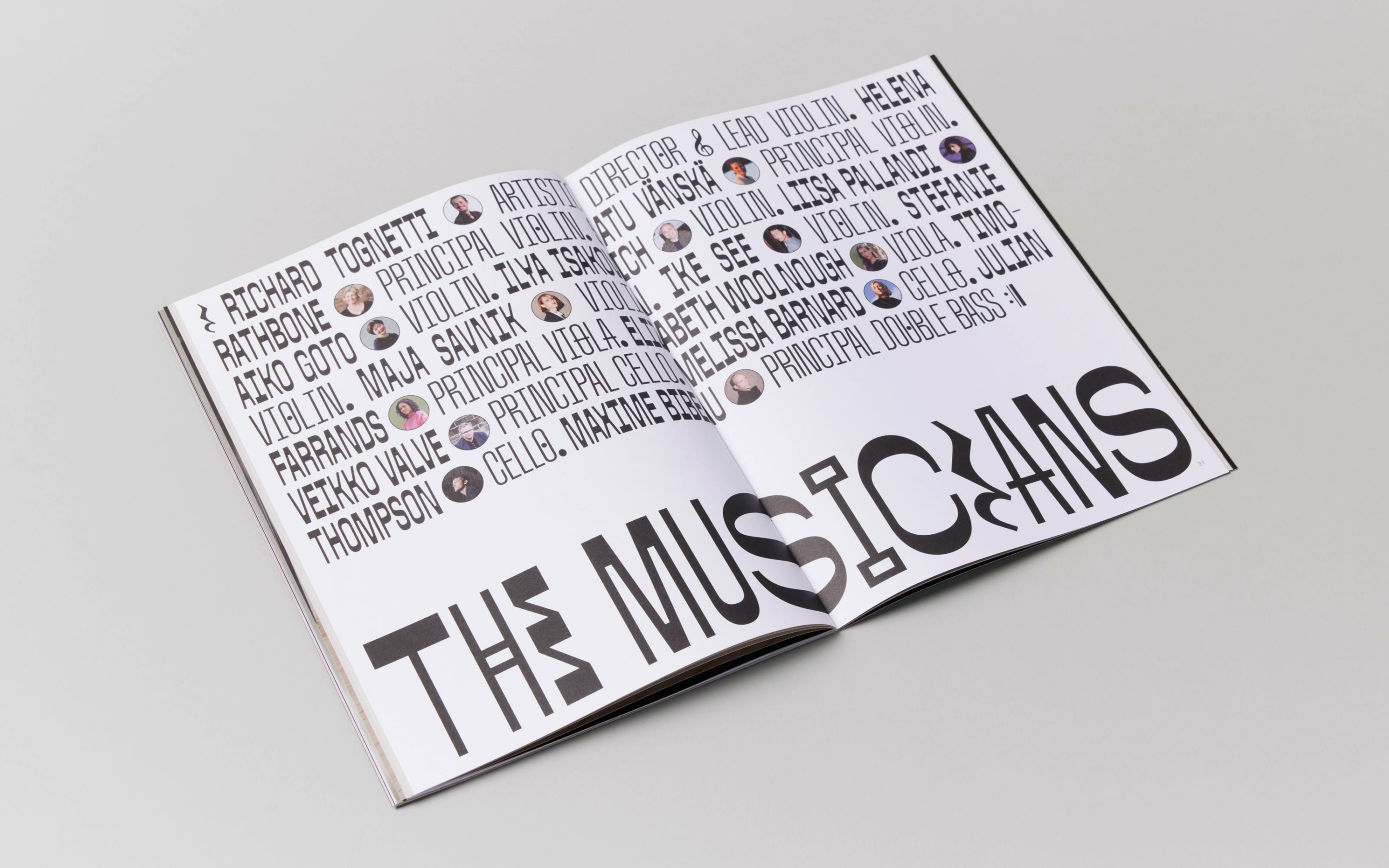
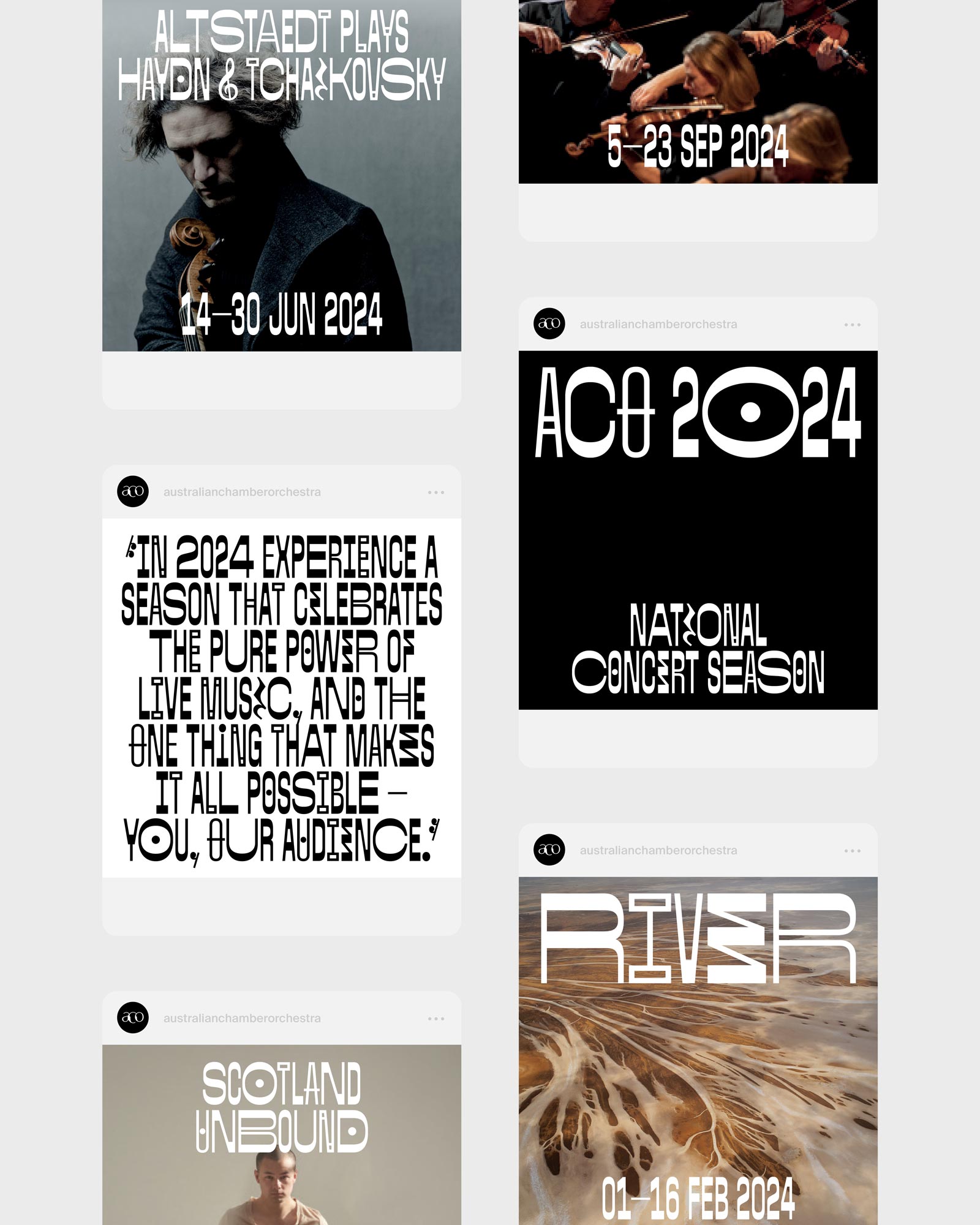
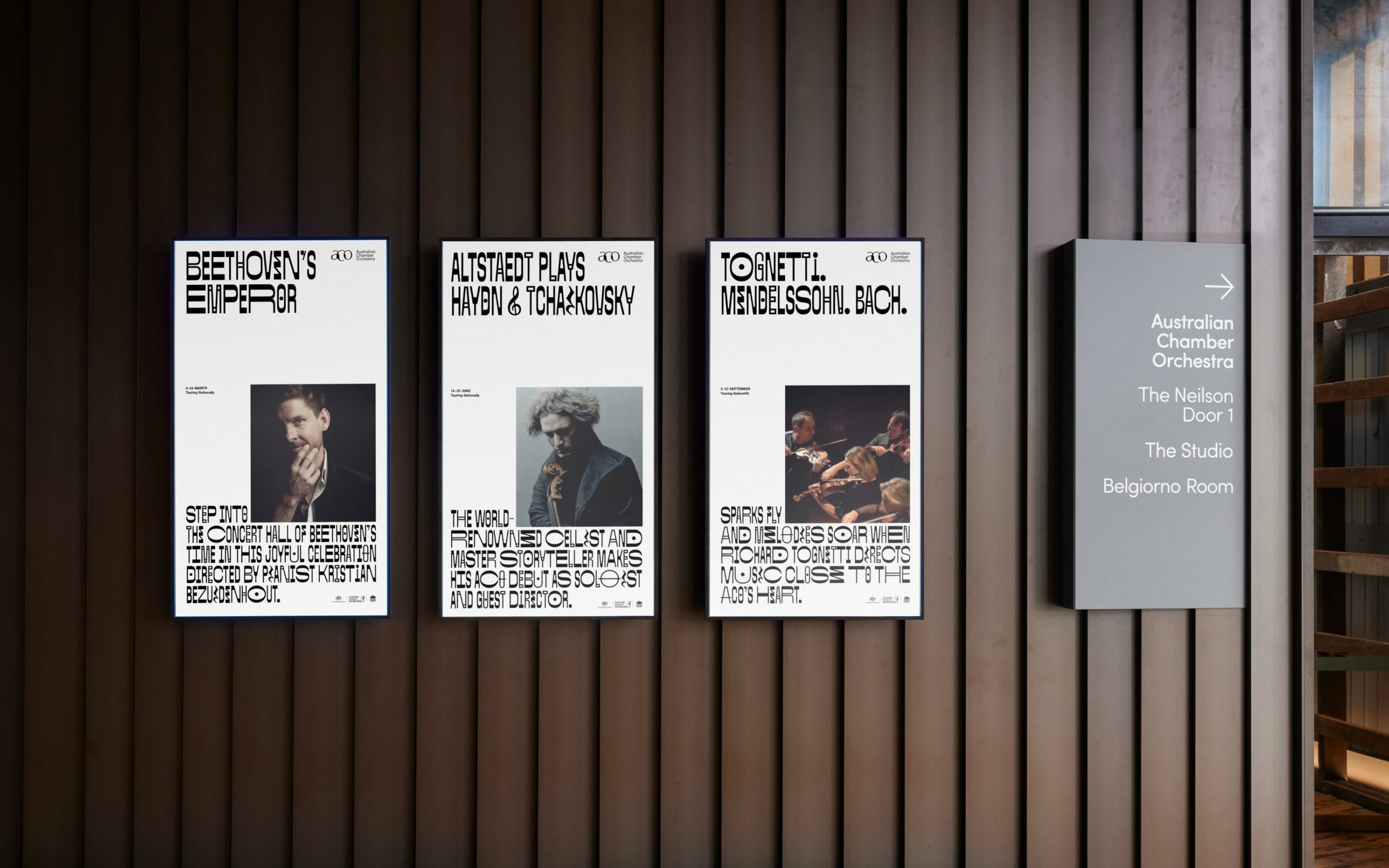
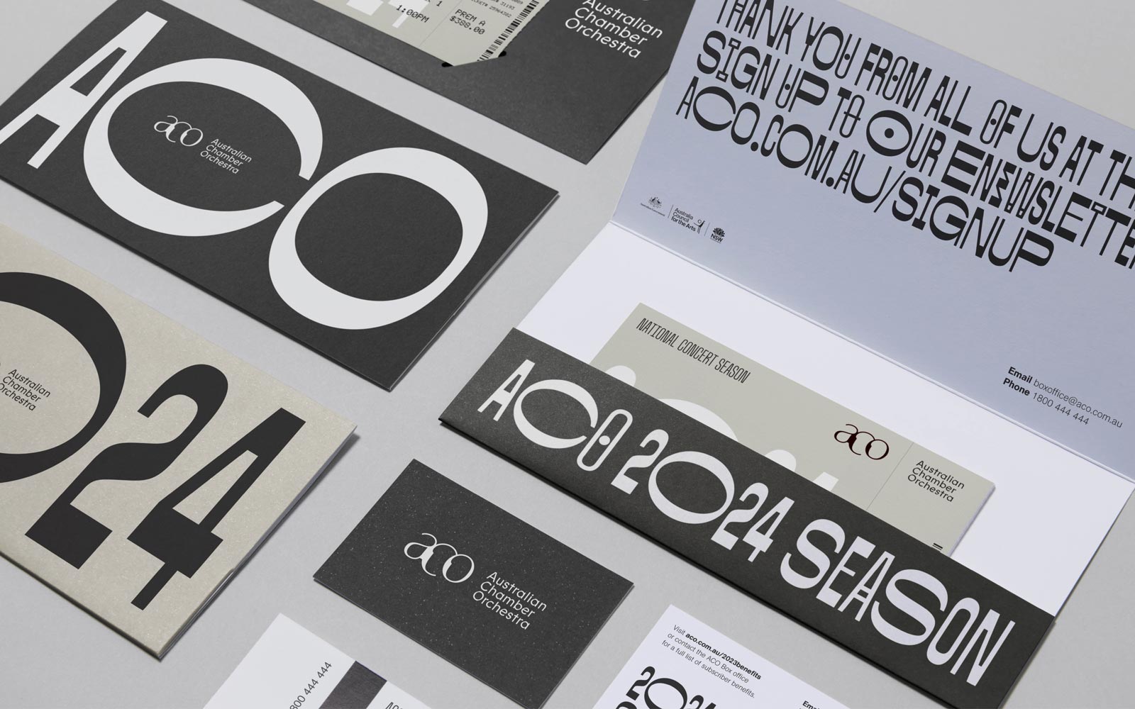
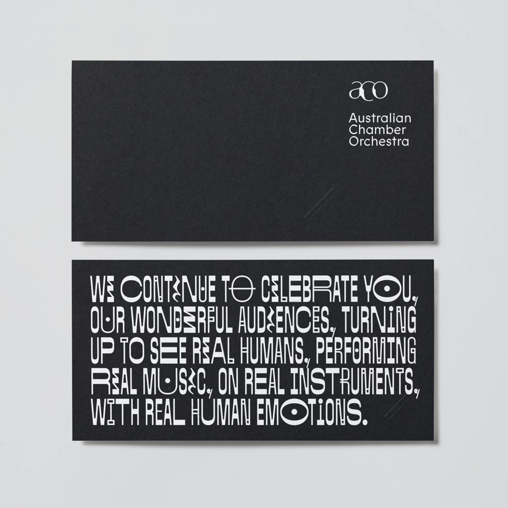
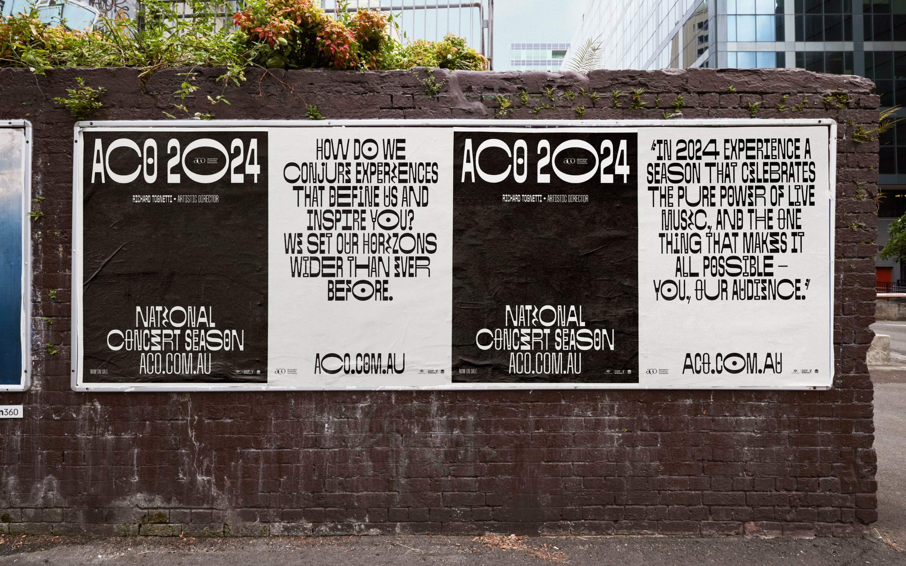
In contrast to the seasons before it, in 2024, we were challenged by the Australian Chamber Orchestra to shift away from photography as the central medium to share their season. In close collaboration with Matter of Sorts and Tame Feral Studio, we developed a bold new typographic suite inspired by intricate music notations. Titled ‘ACO Sans,’ the custom typeface is characterised by its distinctive reverse contrast found in musical notes and is further enhanced by four in-built widths, a myriad of alternates, and a special selection of glyphs found in musical scores. The bold outcome helped shape a new voice for the ACO Season and placed the focus on their inventive new program and exciting list of future guest performers.
Type design. Matter of Sorts + Tame Feral